Driving operational clarity in Fleet Management

(Introduction)
Fleet command centre
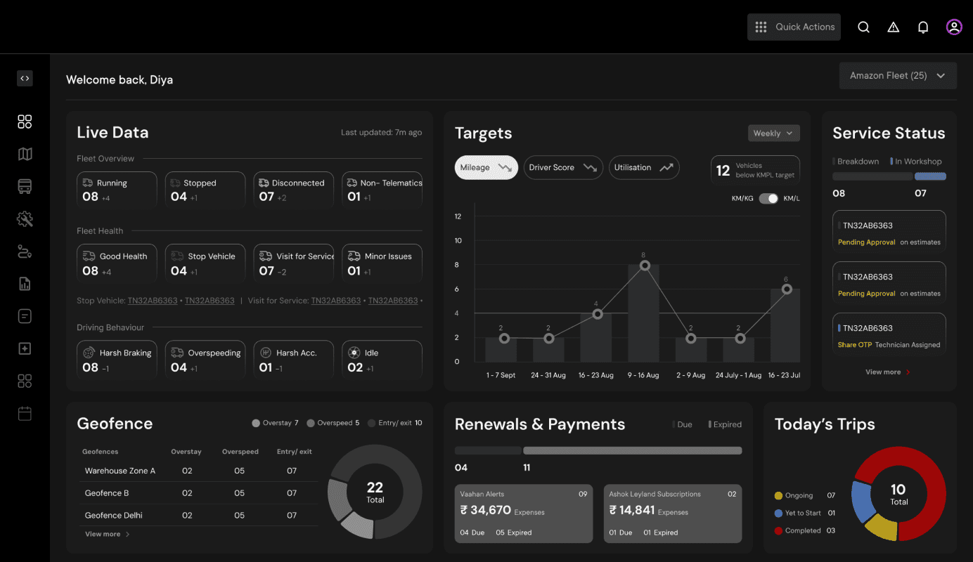
An intelligent dashboard that brings real-time control to commercial fleet operations across India. Every morning, operators see a prioritised briefing, a curated view of what needs immediate attention. Each alert connects directly to action, eliminating the need to hunt across screens or switch between apps.
Organised around urgency and not features, so operators act faster, turning real-time data into decisions. By consolidating fragmented information into a single, operators spend less time searching and more time running their fleet.
My Role
UX Designer
Team
Design Lead | Sr Product Designer | 3 UX Designers | Sr. UI Designer
Timeline
14 Weeks
Status
NDA
Platform
Desktop and Mobile
One-minute project overview
Problem
Fleet owners and managers experience fragmented visibility across vehicles, drivers, breakdowns, and compliance when managing multiple locations simultaneously. This is a problem because critical tasks like renewals, breakdowns, e-challans slip through the cracks, causing operational delays, missed regulatory deadlines, and inability to respond in real-time.
Design Strategy
Design for fleet operators to make priority-driven decisions through a action-first interface that consolidates fragmented information into a single, real-time command centre. By surfacing direct action links, we eliminate search friction and enable persona based operators to take quick actions.
Solution
A fleet intelligence dashboard that helps fleet owners and managers who want to maintain real-time operational control by providing a task-first command centre. Language accessible onboarding happens via registered phone number verification. A morning briefing surfaces urgent alerts. and direct actions across modules mean nothing requires switching apps.
Deliverables
Validated user research framework with fleet operator personas
200+ high-fidelity UI screens (for mobile and desktop)
Clickable interactive prototype optimized for usability testing
A tokenized UI component library ready for developer handoff
(Agile Design Approach)
Feature priority process for a time-based project

(Research)
Knowing the context
~ 72%
users drop-off due to
broken flows.
~ 38%
users drop-off due to friction-heavy onboarding
> 4.3 mins
task completion time for user to add a vehicle


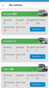


Existing app screens (scroll to view)
Telematics App Architecture

Existing IA of one of the apps
Shocked with the current application performance, we conducted onsite in-person interviews with fleet owners and managers in Gurgaon and Bengaluru.
Alongside, we benchmarked leading platforms including Tata Fleet Edge, Volvo Connect, My Eicher App, Intangles, FleetX, and Scania to identify best practices and experience gaps across the fleet management industry.
We defined two personas we were designing for -

Fleet owner
The business owner. Cares about expense overheads, mileage targets, compliance, and loyalty rewards. In smaller operations, they're also doing the daily operations themselves - managing drivers, approving estimates, handling renewals.
Strategic
Finance
Access Management
Often, a manager too
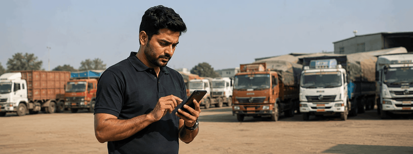
Fleet manager
The operational nerve. On the phone constantly. Needs to act fast - assign a driver, approve a breakdown estimate, flag a geofence violation, chase a renewal. Every extra click costs real time on the road.
Operational
Real-time decisions
Driver management
Speed
Fleet operators need better visibility of vehicles, drivers, and tracking everyday business eliminating the redirections to separate platforms.
Wait
Our roadmap looked like every other fleet management app. All the features, competitors were already shipping. We went back to the interviews and realized we were solving the wrong problem. Not because the features were bad, but because
we weren't building for how operators actually think.
(Reanalyse Research)
Key insights that change everything
Users expertise
The users weren't digitally illiterate, they were operationally experts of routes, fuel, breakdowns, and drivers. The product had to speak their language.
Role changes the flow
In many small-to-mid fleets, the owner is also the manager. Role hierarchy in the product would have broken the workflow for half the target users.
Stakeholders priority
Every alert felt like a P1 to the client. But surfacing everything as urgent is the same as surfacing nothing as urgent. It creates paralysis, not action.
Fleet operators need a priority driven, action-first command centre of vehicles, drivers, and everyday business because fragmented information across multiple touch points causes urgent tasks to be missed.
(Revised Architecture)
‘Final’ Information architecture

(scroll to view full IA)


Wireframes (scroll to view)

Stylescape (scroll to view)
(Design Decisions)
An urgency focused command centre
From manual data entry to instant fleet readiness
Challenge
Fleet operators faced a fragmented onboarding experience. Business details required manual entry of complex information: GST numbers, business registration, fleet composition.
Missing system connection between the operator's identity (phone number) and the business they managed, so systems couldn't automatically detect relevant connection like business, subscription, compliance, or loyalty information.
Driver and vehicle data had to be manually uploaded across different modules before the dashboard became usable.
Solution
Onboarding now starts with language selection respecting diversity. Every subsequent screen, instruction, and message appears in that language. Operators no longer have to choose between accessibility and functionality. Persona identification happens early. The dashboard contextualizes to persona-level visibility.
Next, the operator enters the phone number registered with their fleet company. This single data point unlocks everything. The system instantly retrieves their business details. OTP verification confirms authentication and ownership. From there, onboarding trucks are initiated automatically. Operator can review uploaded truck data and finally watch guided demos.
Drop-off rates reduce because friction is eliminated. Finally, they step into a dashboard pre-populated with the fleet information, real-time alerts, and actionable tasks from day one.
Instantly onboard with your fleet data live and ready to manage.
Homepage making urgency visible & actionable
Challenge
Fleet operators traditionally accessed fleet data navigating to Vehicles, then Drivers, then Service, then Renewals. This fragmented workflow meant operators had to mentally prioritize across multiple parameters, piecing together what was urgent. Critical tasks often surfaced too late.
Managers spent time hunting for vehicle status across different sections.
Breakdown approvals got lost in the flow of routine data.
Renewal deadlines and e-challan notices weren't surfaced until escalation.
Operators couldn't see the full operational picture at a glance.
Solution
New homepage acts as an orchestration layer that surfaces urgency first, then lets operators drill into detail. Instead of module-first navigation, the interface shows:
A morning briefing modal that lists only actionable tasks with direct action links.
Live data cards that pull real-time signals from all modules, organized by operational relevance rather than feature hierarchy
Service Status cards showing breakdown and in-workshop vehicles with pending approvals visible, enabling instant decision-making without entering another module.
Flagging the fleets which need to immediately stop, service or any other attention.
Fleet operators see urgency first, act instantly, without switching screens or hunting through modules.
Unified modules workflows
Challenge
Fleet operators relied on separate applications for different functions. One app for tracking, another for telematics, a third for service management. These apps operated in silos. Workflows were fragmented, context was lost between transitions, and operators couldn't see connections between data points.
Operators faced two frustrations: either scroll endlessly through unfiltered data, or navigate deeper into nested detail screens, losing sight of the bigger picture they were managing.
Solution
Most importantly, interconnected module integration. From a Vehicle detail screen, an operator can see its Trip history, Service status, Driver assignment, and Geofence violations. Actions flow across modules.
Two-column pattern keeping both context and action visible simultaneously. This eliminates nesting and lets operators drill into one item without losing context.
Filtering through tabs is the difference between scanning and searching. It reduces large lists to one click, making status visible at a glance.
Actionable buttons are prioritized based on our primary research. This prioritization prevents decision paralysis and guides operators toward the right action for the moment.
Unified workflows across modules. Discover, filter, and take actions without losing context.
Manual to real time alignment of the driver-vehicle mismatch
Challenge
Fleet operations rely on precise driver-vehicle-trip alignment. A driver assigned to the wrong truck, or a vehicle matched to a wrong trip, results into late deliveries, missed targets, and revenue loss. Before this system, alignment happened manually. Operators and drivers coordinated via calls or messages. If a driver spotted a mismatch on the morning of a trip, they had to contact the operator, wait for a response, and hope the corrected assignment came through in time. Sometimes it didn't. The process was slow and error-prone.
Solution
A critical alert system for what used to take hours of coordination now resolves in minutes. The module interconnectivity means every reassignment cascades automatically.
The moment a ticket is raised, it surfaces as a critical notification to the fleet operator. The operator reviews the mismatch in context of the driver detail screen, vehicle status, and trip requirements side by side.
If reassignment is needed, they select an available alternative vehicle, which automatically updates the trip details and tags the original vehicle as unassigned. If the assignment was correct, they can connect with the driver directly through the details provided.
Driver vehicle mismatch alignment resolved in seconds.
(What Next?)
Expected impact & next steps
MVP launches into validation. We'll measure whether operators truly spend less time searching and more time acting. Hitting these targets will guide Phase 2.
~ 50-55%
reduction in user drop-off due to broken flows
~ 20-25%
reduction in onboarding friction drop-off
2x
faster task completion for new users adding vehicles
Phase 2 Sophistication introduces in-app payments, driver training, and fuel monitoring. Operators who've mastered the morning briefing are ready for deeper workflows. The philosophy scale up, but the core remains: fewer clicks, faster decisions.
Phase 3 Ecosystem explores voice chatbot, predictive alerts, load marketplace. But first, we validate that the foundation works.
(Reflection)
What I learned
Synthesise before you structure
Field research was rich, but we jumped straight to IA. We skipped the messy synthesis phase, really sitting with contradictions & mapping behaviours. That gap made defending design decisions harder than it needed to be. Hence, let insights breathe before structured.
Map user combinations early
We treated personas as a design challenge when it was just reality. The people running fleets are digitally illiterate but operationally brilliant. We need to design for their expertise first, then onboard them to digital. That mindset shift changed everything.
Design for scalability, not sprint
Based on prioritisation framework, client questioned MVP. How would this scale into P1, P2? Rightfully so! Every product needs to be designed for scalability. Even when deadlines are hard, that's a non negotiable.