Lightening lifestyle
with smart switches

(Introduction)
Smart switch application
An IoT application that brings convenience into the luxury lifestyle. High intent owners wake up to moods that adjust lights without touching a switch. Morning routines activate automatically. Evenings respond to their presence. They control their space, app handles the logic and the hardware stays premium.
The freemium model is where the strategy gets interesting. The core promise is easy control and responsive automation wrapped in elegance. But underneath, the app smartly tracks energy patterns and surfaces insights through gamification; informing users where they're consuming and how they could optimize. That curiosity bridges to the subscription tier, where AI predictions fully unlock the system's potential.
My Role
UX Designer | Visual Direction setup
Team
Design Lead | 2 UX Designers | Sr. UI Designer
Timeline
12 Weeks
Status
NDA
Platform
Mobile
One-minute project overview
Product Area
High intent owners want smart homes that require no active assistance. They desire automation that feels as personalized as the spaces themselves - premium, convenient, effortless. Most IoT solutions demand either technical fluency or professional installation, creating friction incompatible with their lifestyle. The smart switches application bridges this gap with a single setup of the luxury switches with thoughtful intelligence.
Design Strategy
Design for a freemium model for homeowners with limited technical fluency to adopt and convert to paid features. This meant building linear onboarding with documented help at every step, a hands-on demo mode before commitment, and a product tour upon landing. By removing cognitive overhead from the initial experience, the free tier becomes genuinely rewarding. Gamification bridge users to subscription, creating curiosity about deeper home automation and AI-driven consumption optimization.
Solution
An intuitive app paired with luxury physical switches that let homeowners create moods (morning routines, evening ambiance, entertainment scenes) with a single setup. The system responds to time of the day, motion and routines. Gamified insights surface consumption patterns and AI-driven optimizations, making the path to subscription features feel like reward rather than upsell.
Deliverables
80+ high-fidelity UI screens for mobile application
Clickable interactive prototype optimized for dev-walkthrough
Implementation guide for developer handoff
(Design Approach)
User-centred design process

(Research)
From concept to design
The client came with an AI-generated application concept. Rather than take it as-is, we audited the user flow to understand what was working and where it could be simpler.
The smart home control space is rapidly evolving, driven by growing expectations for seamless, intuitive, and premium experiences. As homes become more connected, users expect interfaces that not only control devices, but also orchestrate entire environments across lighting, switches, appliances, and automation.


AI-generated concept presented by clients (scroll to view)
Here,
we found that the design was clean and logically structured. But it made things harder for users, not easier. A few clear gaps stood out - ones that, if fixed, would make the whole experience feel more natural.
Onboarding Gap
The app skipped device setup and landed users on an empty homepage. With nothing connected, there was nothing to do—users hit a wall before they could even experience the product.
Nested Actions
Adding a device meant drilling through layers: bungalow > room > closet > switch. But user mental model won’t understand that. They expect to add devices quickly, right where they need them.
Missing Module Cross-linking
Users had to navigate to different modules to control their home. Users wanted access from anywhere and everywhere. This violates user’s flexibility and control over the app.
Missing Safeguards
No confirmation before deleting a scene, no way to edit once you'd created something, inconsistent terminology, and no guidance when things went wrong violates error prevention and recovery.
Our product sits in the luxury smart switch segment, where design quality, effortless control, and the feeling of refinement are as important as technical capabilities.
After the audit, the focus shifted to understand leading global and regional platforms including Google Home, Apple Home, Samsung SmartThings, Philips Hue, Amazon Alexa, Philips Wiz, and Wipro Next Smart Home. The analysis mapped how each platform handles onboarding, space organization, device control, and automation, surfacing both industry benchmarks and gaps within the luxury smart switch category.


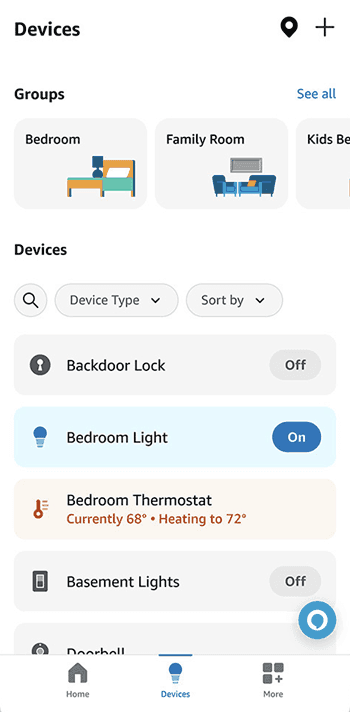


Leading platforms in market (scroll to view)
Guided and effortless
Onboarding is getting better across the board. More visual, more structured. But technical complexity still lingers. There's room for an onboarding experience that feels genuinely effortless.
Premium is rare
Apple Home and Philips Hue set the visual bar. Most others, especially catering to mass feel utilitarian. A luxury interface that's minimal and architectural has clear whitespace to own.
Signature interaction
Most platforms lump switches into generic tile systems with no distinction. Purposeful switch interaction design is an open opportunity to build a recognisable product signature.
System over user
Every competitor expects users to adapt to the system. Designing an interface that adapts to the user through contextual awareness, personalised defaults, and smart AI recommendations is the clear differentiator.
We defined the archetype we were designing for -

The Luxury Homeowner
Mid to late 40s, Australian owner with a busy schedule and a carefully considered lifestyle. They invest in quality whether it's the art on their walls, the car in their driveway, or the switches on their walls. Technology is welcome in their home as long as it stays invisible and works without asking too much of them. They care about their environmental footprint but won't compromise on comfort or aesthetics to address it. Security and privacy aren't negotiable. And when a product genuinely improves their daily life, upgrading is an easy decision.
Premium Taste
Comfort
Upgrades for Status
Sustainability Minded
Fleet operators need a priority driven, action-first command centre of vehicles, drivers, and everyday business because fragmented information across multiple touch points causes urgent tasks to be missed.
(Information Architecture)
‘Final’ Information architecture

(Revised Architecture)
User flows


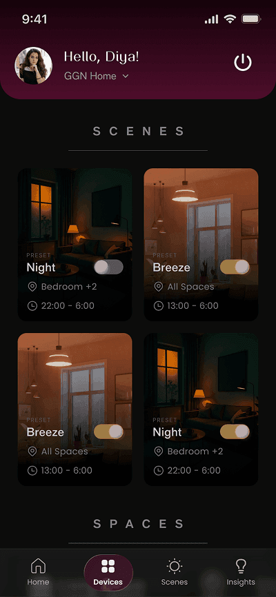


Hi fidelity Wireframes (scroll to view)
(Design Decisions)
A luxury smart switch application
Onboarding and guided setup
Challenge
Affluent users in their mid to late 40s don't want to spend time figuring out an app. But a sign-up-only onboarding that lands them on an empty homepage leaves them with nothing to do and no reason to stay. The real challenge was guiding users through device setup—without making it feel like a technical process.
Users needed familiarity with the app before committing to device setup
An empty homepage with no devices connected offers no value and no first impression
Device onboarding via Bluetooth or QR carries a natural learning curve that could easily overwhelm or drop users mid-flow
Solution
A guided, linear onboarding that takes users through one step at a time. Sign up, demo mode, device setup, before landing on a functional homepage. No skip option through the critical path, because arriving with a connected device means users experience the product immediately.
A demo mode after sign-in familiarises users with the app's interactions and what they'll find inside, building curiosity before setup begins
Bluetooth detection surfaces multiple devices at once but sets them up one at a time, keeping the flow focused. QR scan remains available as a fallback for detection failures
Device onboarding follows a documented, step-by-step flow so users always know where they are and what comes next
A skippable product tour guides users from their first connected device to scenes, helping them complete a meaningful action before fully exploring on their own
Device setup success rate on the first attempt is the clearest signal that onboarding works. When users reach a connected homepage without needing to retry, abandon, or seek support, the experience has done its job.

Onboarding and guided setup (Hover to pause)
Homepage
Challenge
A homepage that simply lists rooms and devices gives users no reason to stay on it. Managing a home shouldn't require navigating into modules for every action. Users expect their most relevant controls immediately accessible. The challenge was designing a homepage that works as a genuine control centre on first and every visit.
Design fatigue for users who have just completed a lengthy device onboarding
Scene setup had to feel intuitive, since configurations can be technical
The homepage needed to reflect the home's live state at a glance, not just offer navigation
Solution
A personalised homepage is the centre of the experience where control, ambiance, and intelligence meet. Built on a visual language of subtle gradients, minimal layouts, and calming animations, it doesn't just reflect the app's premium aesthetic, it mirrors how the home feels when everything is working as it should. Users return here to check, control, and over time, understand their space better.
Allows personalisation around the scenes users reach for most
Active scenes come alive with continuous ambient animations using gradients that visually echo the mood they're set to, while inactive scenes stay static.
Modes like Away from Home and Lights Out sit as a quick action, overriding all active scenes with a single tap
For free users, energy insights widget show consumption patterns. For subscribers, AI-driven automations unlock. Making the upgrade feel like a natural next step, not a sales push
App Homepage (Hover to pause)
Devices
Challenge
As users add more devices across spaces and subspaces, the risk isn't losing control, it's losing clarity. A growing home setup can quickly become a maze of switches, rooms, and automations that feels more like a technical dashboard than a living space. The challenge was giving users complete flexibility to build, name, nest, and automate their space without the experience ever feeling complex.
Users needed the freedom to name, structure and organise spaces their way.
Automation options had to feel like natural extensions rather than a settings panel.
Devices, scenes, and spaces needed to feel connected, not siloed into separate modules.
Solution
A devices module that feels more like a live map of the home. Users build their space hierarchy the way they think about it - Property > larger space > subspace (optional) > switchboard.
Full flexibility to reorganise spaces at any point without starting over
Schedule and motion-based automations set directly at the device or space level, so lights respond to how the space is actually used
Device setup is a linear, guided journey established during onboarding, so adding a new device doesn’t feels technical
Documentation is always available upfront within the app, giving users a reference point at every step without having to look elsewhere
Each switchboard renders as a digital twin of the physical hardware, toggling individual switches and controlling brightness, setting a new benchmark in the luxury smart home category.
Repeat device setup and space organization: if users add a second or third device without dropping off and go beyond the default setup to create subspaces, the flexible linear flow is actually working.
Organise your space and devices (Hover to pause)
Scenes
Challenge
Creating a scene sounds simple. Set the mood, pick the lights, save it. But in practice, users are making multiple decisions at once: which switches, which settings, how it activates, when it runs. For users who aren't technically fluent, too many simultaneous choices at any one step is enough to abandon the flow entirely. The challenge was making a deeply configurable feature feel effortless.
Flexibility of choosing different set of switches in a single configuration journey can lead to high cognitive load
Activation types - manual, time-based, motion, or voice had to be presented as simple choices, not technical settings
Pre-configured presets had to feel like a guided starting point, not a limitation
Solution
A linear scene creation flow that breaks every decision into a single step. Switch selection > Flexible configuration > Activation method > Personalisation.
Presets on the empty state give new users an immediate starting point, pre-configured moods that can be assigned to any space and altered based on user’s needs.
Flexibility to configure all selected switches at once, fine-tune individual ones, or the whole space in the same linear journey with minimum clicks.
Documentation is always available upfront within the app, giving users a reference point at every step without having to look elsewhere
First scene creation without drop-off validates that the flow is clear enough for a user navigating it alone. Over time, how many scenes are actively triggered on a routine basis tells the deeper story. Whether scenes have genuinely integrated into how users live, rather than being set up once and forgotten.
Personalise scenes based on your lifestyle (Hover to pause)
Insights
Challenge
Luxury users don't respond to cost-saving messaging the way most apps assume. Telling someone who owns a luxury home that they're spending too much on electricity isn't a motivator, it's irrelevant. The real challenge was framing energy awareness around consumption and sustainability, not just spend.
Consumption data had to feel personal and contextual, not like a utility bill
Gamification had to create genuine curiosity, not just a subscription push.
The line between free insights and subscribed automations had to feel like a natural upgrade, not a paywall
Solution
An insights module that tracks energy consumption by space, device, and duration. Colour coded so users immediately understand if their usage has shifted. With month-on-month comparisons that make patterns visible without explanation.
Users can set their energy provider and billing method for accurate per-unit consumption tracking, making insights feel precise and trustworthy rather than generic
Increase curiosity with AI-suggested smart automations appear as locked cards for free users, each one showing the mood it sets and the kWh savings it could unlock, with a tap revealing exactly what it does before committing to subscribe
Automations are framed around lifestyle and routine, not efficiency metrics like “Dim after midnight. Save 80kWh/month"
Subscription conversion rate is the clearest business signal. When free users engage and convert to subscribers, the gamification is working. Curiosity has turned into commitment.
Get actionable insights on your device usage (Hover to pause)
(What Next?)
Expected Impact
By solving for a luxury industry with generic solutions, aim is to make automating lights disappear into a lifestyle. Every design decision was made to make home control feel effortless, intuitive, and worth investing in.
~ 70-75%
device setup success rate on the first attempt
~ 3+
scenes actively triggered per week per user within the 1st month.
~30-35%
free to subscriber conversion rate within the first 180 days.
(Reflection)
What I learned
Understanding user demography
Designing for affluent users taught me that premium isn't just a visual decision. When cost isn't a barrier, the only thing that earns loyalty is how effortlessly the product fits into someone's life. That reframed every design call I made on this project.
Flexible design flows
Building on a product still in early production meant the logic kept shifting. Switch configurations changed and flows had to adapt without being scrapped entirely. I learned to design with enough flexibility that a logical change in the product didn't mean starting over.
Dev handover
Handing off a product this interaction-dense to developers made me realise everything needs to be thought through and documented. Collaborating closely with developers on technical constraints made the final product sharper.