Metaling an industrial annual report
My focus
Information Architecture and wireframes
Duration
4 weeks (80 hours)
Sector
Steel manufacturing industry
Overview
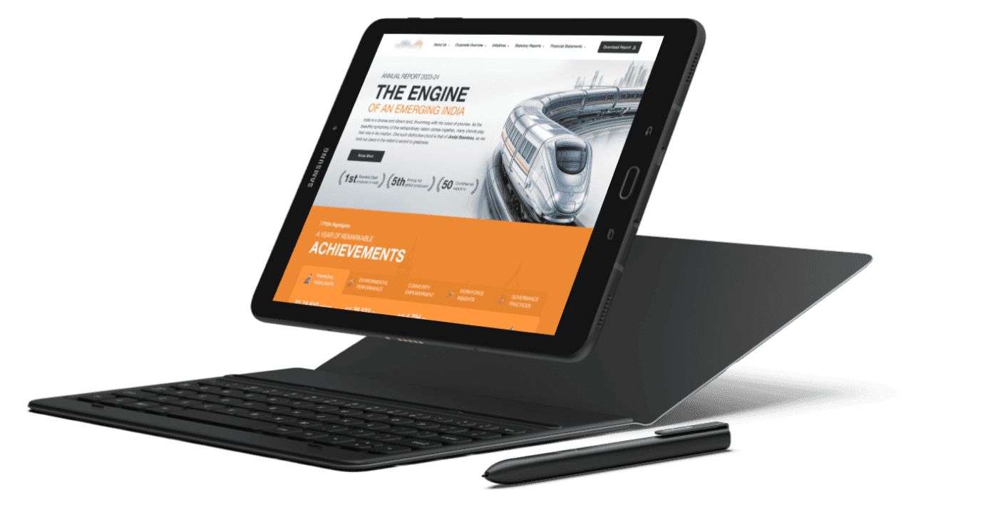
A microsite that accurately replicates the stainless steel manufacturing company's annual report PDF, preserving its original design and content. By adhering to existing guidelines, developing an effective information architecture, and exploring different homepage layouts, we will create a visually appealing and user-friendly microsite that meets the client's expectations.
Background
The annual report booklet was designed by ScreenRoot’s sister company- ReportYak (specializes in annual reports). We got the brief through our internal team and then client connected and asked us to replicate the report into a microsite.
DEFINE
Overview
RESEARCH
Client brief
Annual report
constraints
DELIVER
Wireframes delivered to UI team.
DESIGN
information architecture
wireframes
Microcopy


Brief
A microsite that replicates the client’s annual report to enhance accessibility and engagement.
Challenge
The project has a tight deadline and budget, limiting the scope of work in means of assets and other guidelines.
Outcome
An accessible and engaging site with prioritized content keeping in mind the user base.
What did the client want?
The client wanted a basic microsite replicating their annual report document.
Brief
Date-
23 August 2024
Team-
3 UX designers
Why is there a need of a microsite of an annual report?
While the existing annual report PDF provides valuable information, a microsite can offer several advantages. A microsite allows for easier access, sharing, and searchability. Additionally, it can be customized with interactive elements and multimedia to enhance the user experience.
What are we trying to achieve?
We aim to create a microsite that accurately replicates the annual report PDF, also to enhance its accessibility and engagement. By providing a user-friendly platform with clear navigation and interactive elements, we can improve the overall experience for stakeholders and potential investors.
Key Platforms- A separate domain
Touchpoint- Brand’s main website
“If the end product turns out to be great, we would like to get our company website revamped by your team”
In market trends


Constraints!
Due to the client's strict budget and time constraints, which limited the scope of work, our design team couldn’t explore complex interactions that would have enhanced engagement and user experience.
What did we deliver?
We delivered a microsite featuring an efficient information architecture and engaging content.
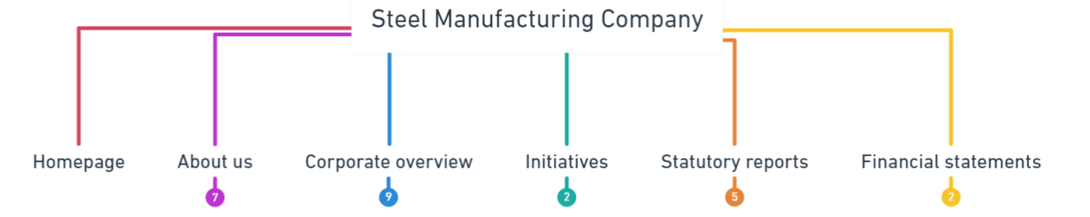
Information Architecture
We understood the report's index and created information architecture based on categorization and user mental models observed on similar websites.
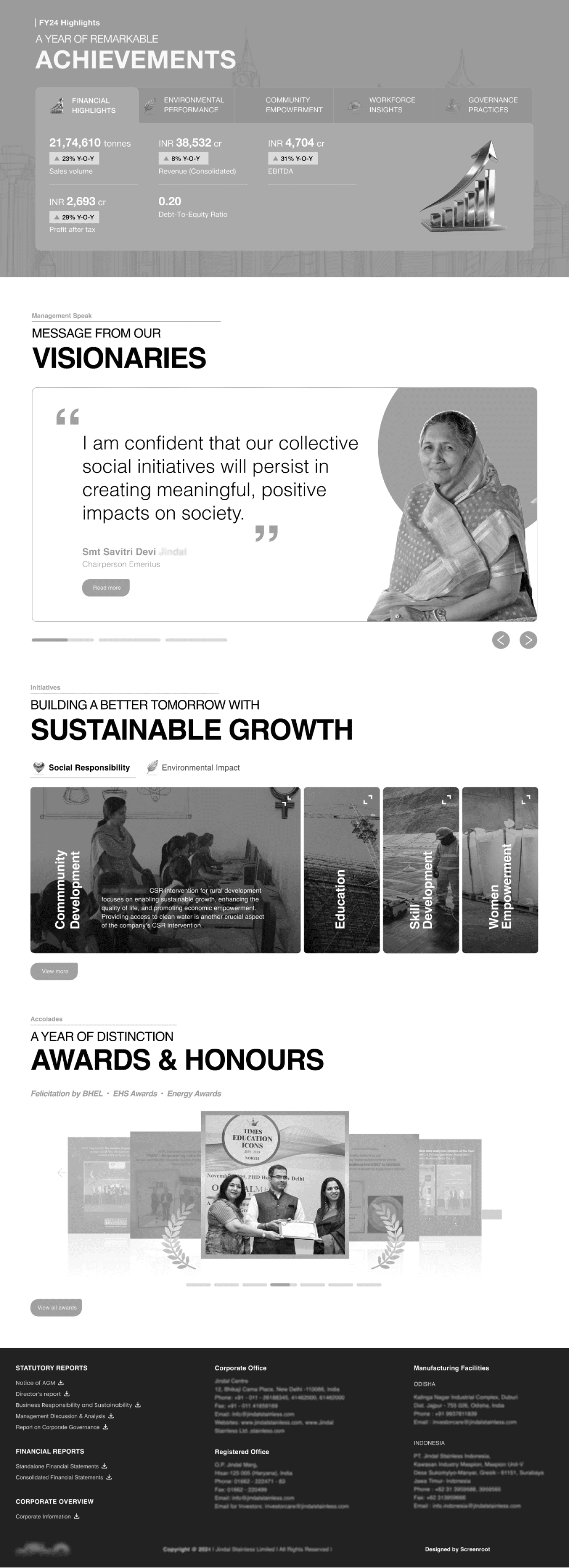
Homepage iterations
Given the flexibility to structure the homepage, we prioritized the content into sections and included CTAs directing users to relevant inner pages.
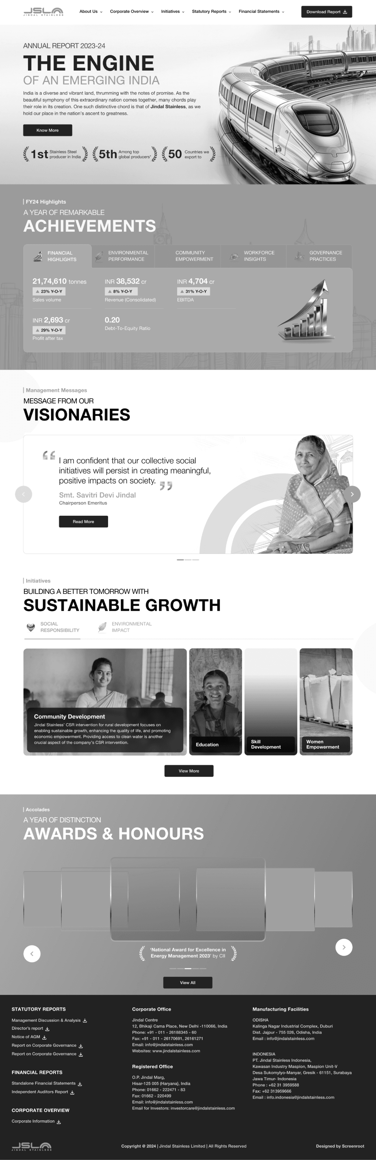


Final wireframe
The UX team delivered the following wireframe to the UI team after getting approval from the client. Made the responsive version as well to validate the interactions.
Micro interactions to engage the users with the statistics
Presenting leader’s messages leading to respective inner pages.
Provided direct links for accessing reports and geographical details.


Additional explorations:
Practice gives perfection! Despite the limited scope of work, I explored other possible interactions and renditions.
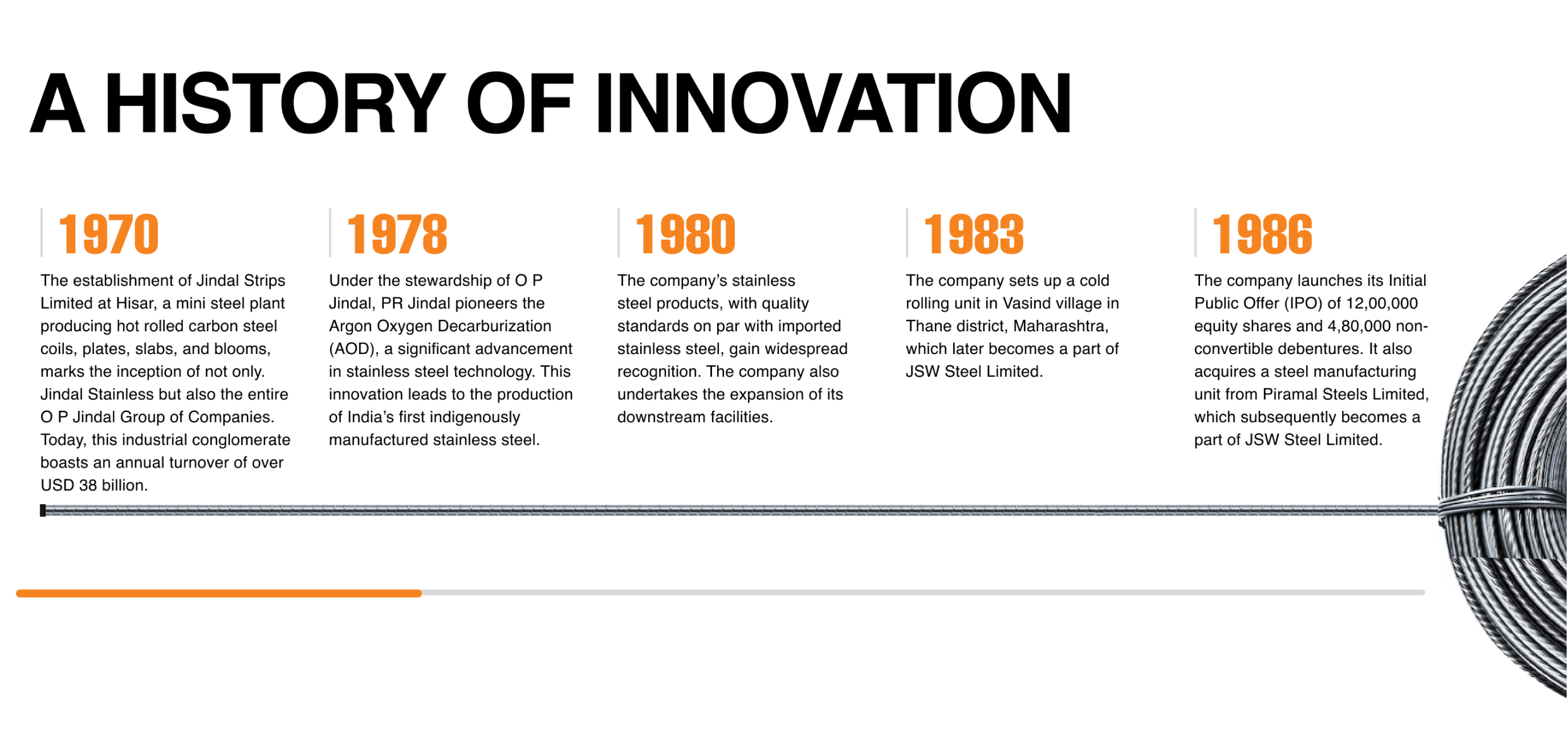
About
A section from legacy and milestones with 20 years of information provided-
My concept
Implemented horizontal with a progress bar to indicate the remaining content.
Engagement reduced visual load.
Increased the number of folds.
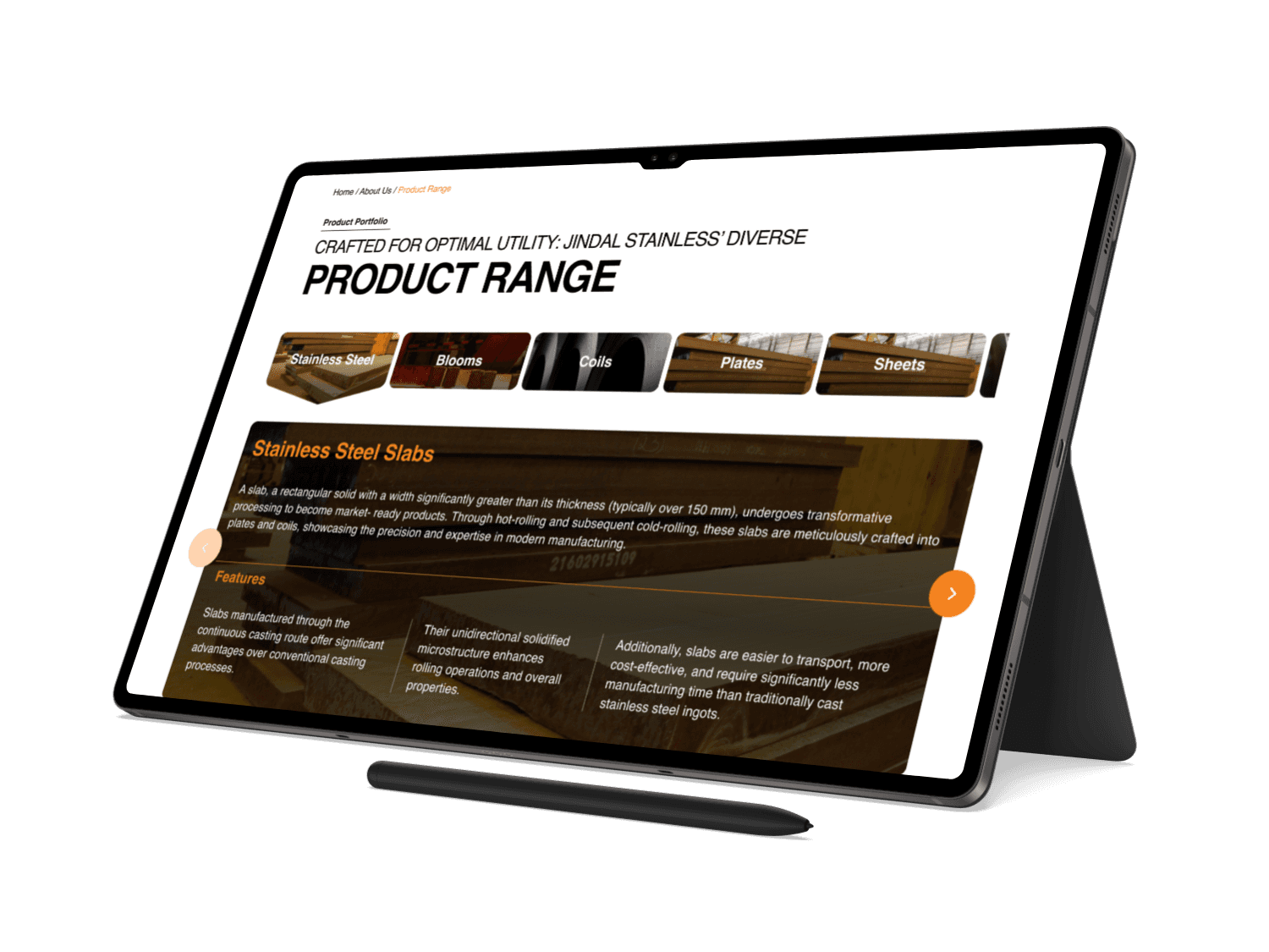
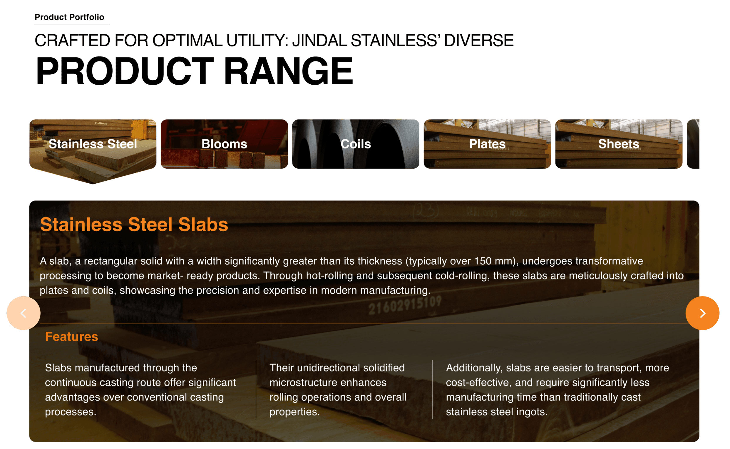
About
Product listing page along with their features-
My concept
Innovative tab style with content upfront for the active one.
Visually appealing interaction
Less focus on quantifying the products by not providing all names upfront
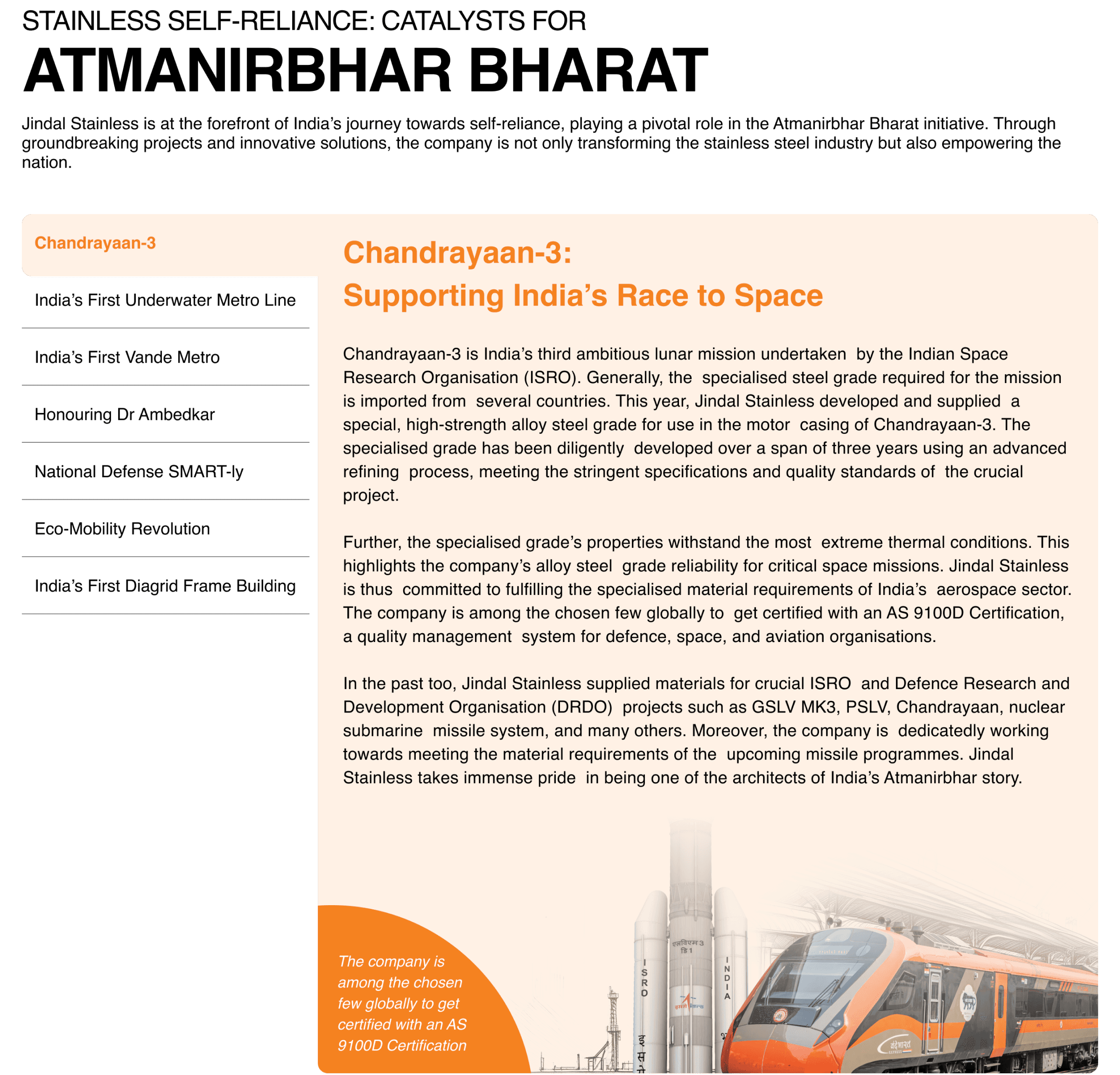
About
Project listing page covering 11 particulars-
My concept
Vertical tab style, keeping names upfront
Increased number of folds.
In case of longer names, tab style would be inconsistent.
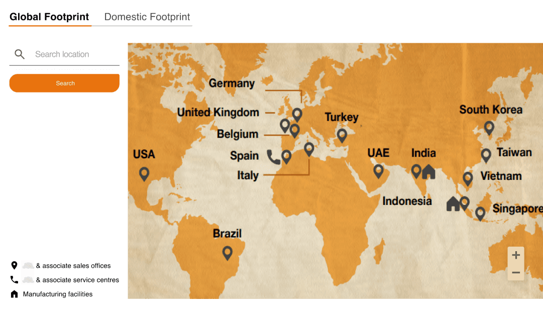
About
Geographical locations of manufacturing sites-
My concept
Changed a jpeg to an interactive map.
Engaging way to let user interact.
Is out of scope of work as per the project guidelines.
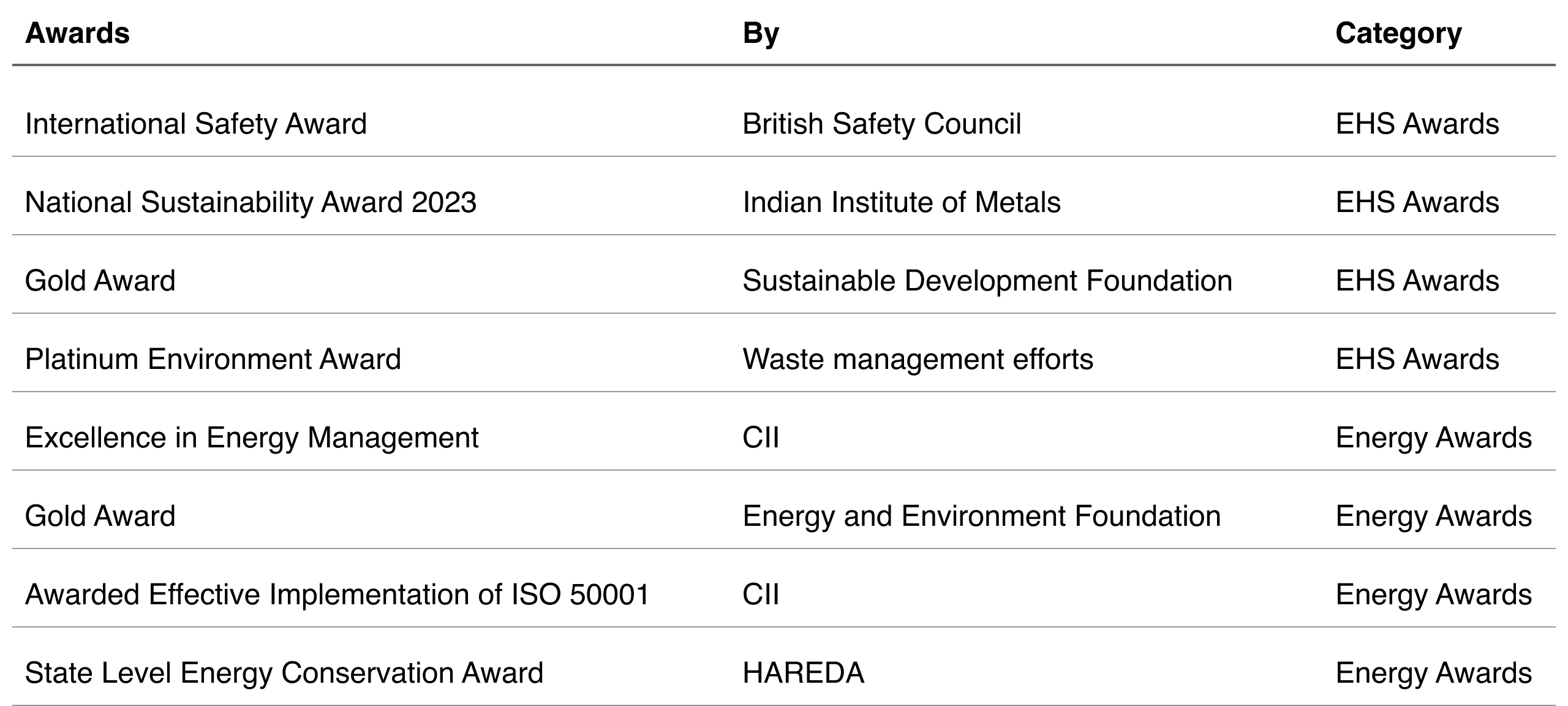
About
Awards page with inefficient list of categories-
My concept
Transformed laundry list of data to structured set of information
Easy to understand layouting.
The content provided doesn’t cover the information required to fill all the fields.
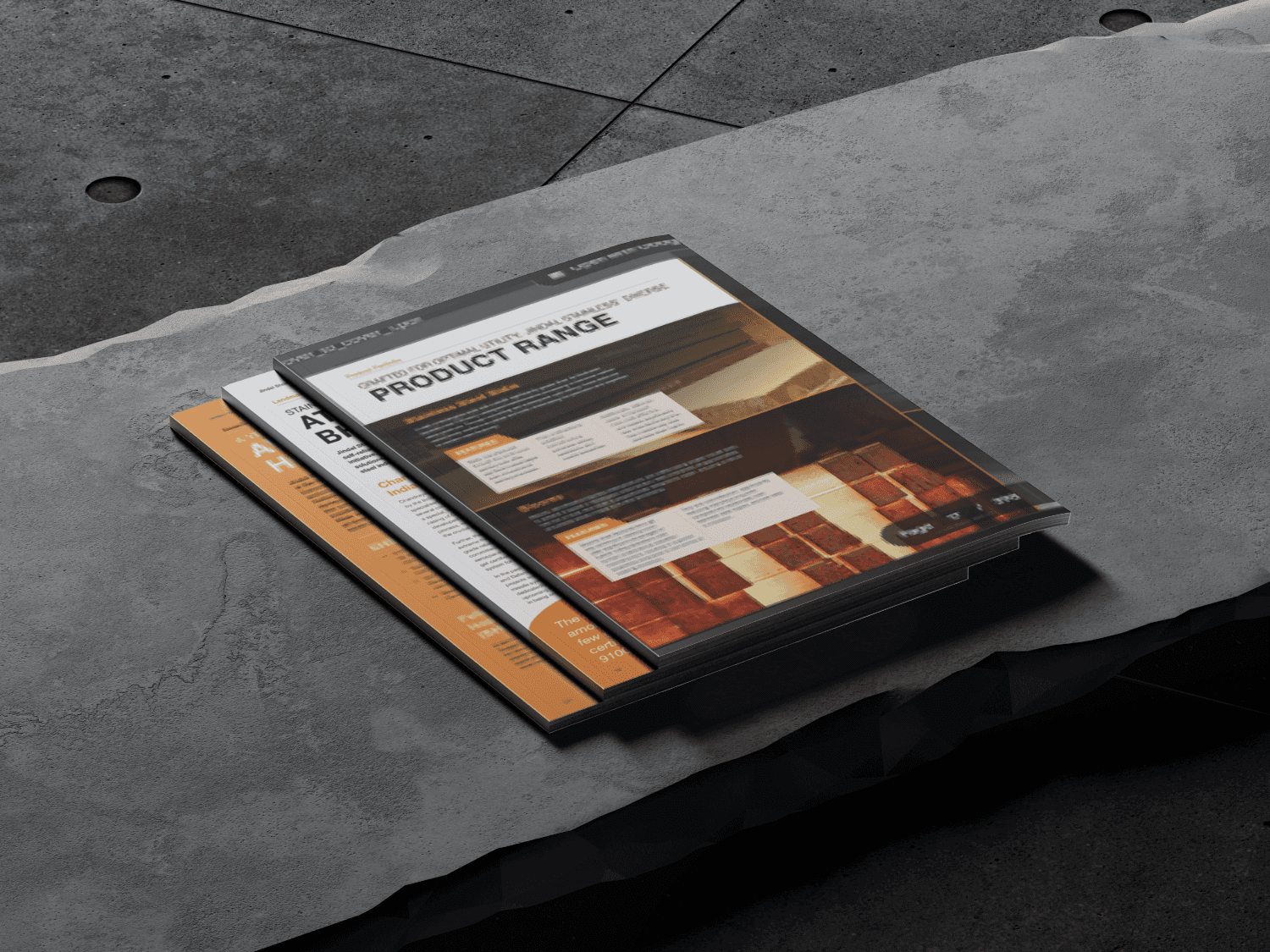
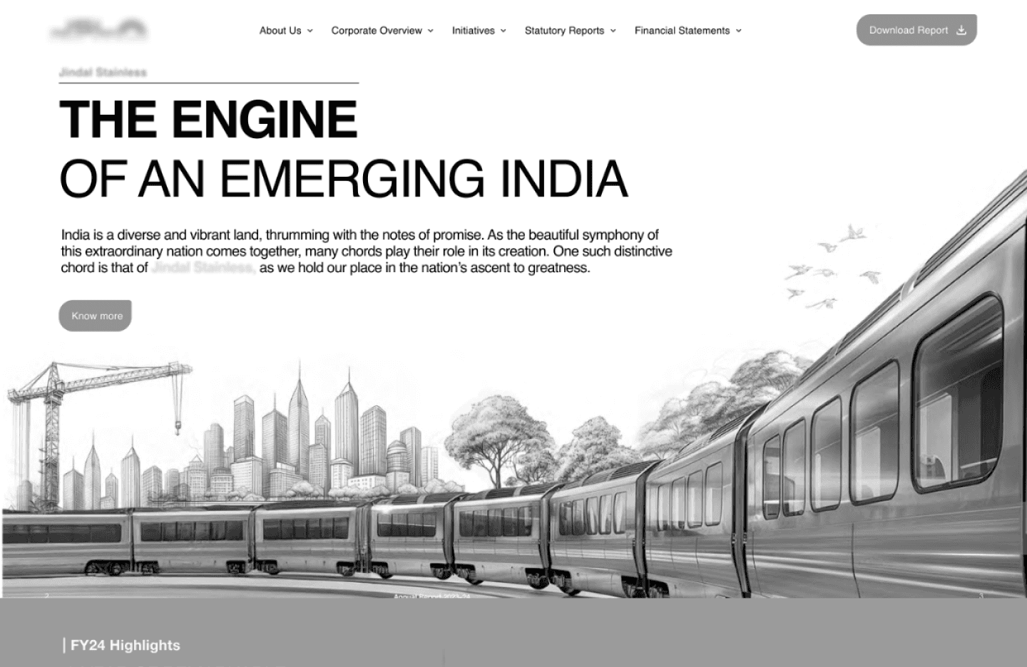
Sneak peek of visual design
With the primary focus on a user-friendly interface, it had to be a game changer!
We handed over the initial basic wireframes of the homepage to the UI team, trusting their expertise. Simultaneously, we explored potential interactions to enhance user engagement within the scope of work for the inner pages.
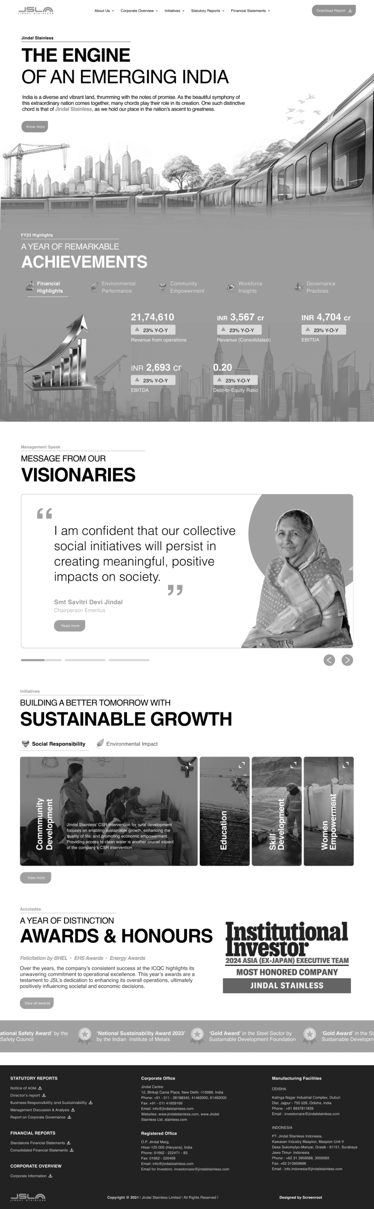
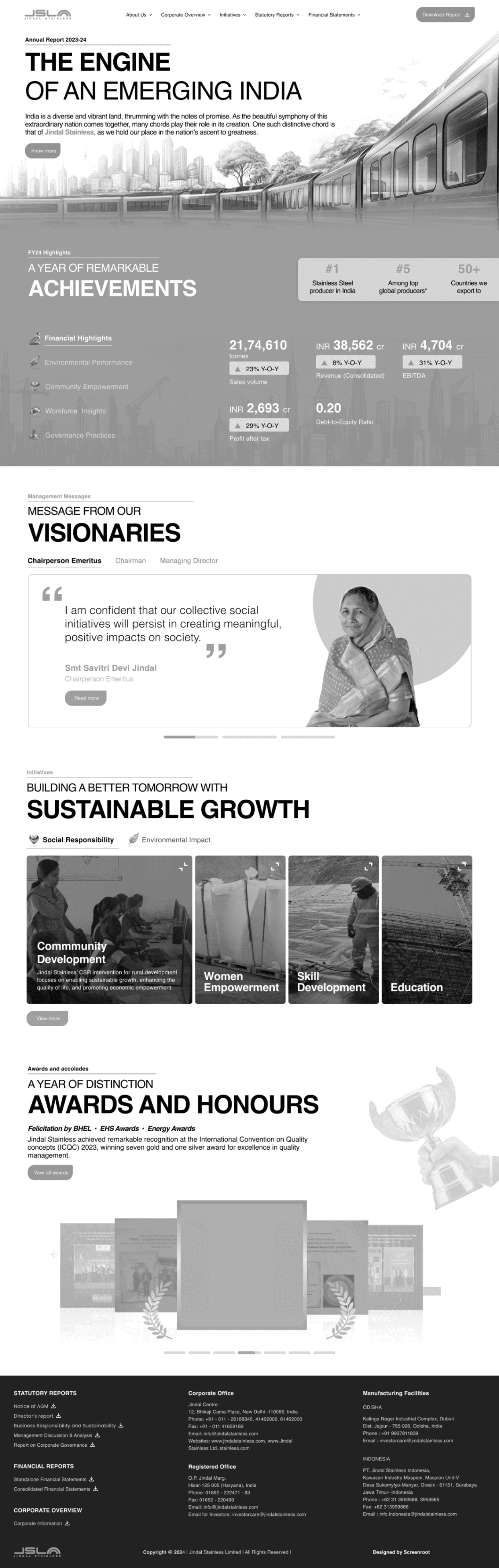
Presenting you the annual report microsite of one of the leading stainless steel manufacturers of India-

Learnings and Takeaways
With so many constraints, comes lots of learnings!
#1 Scope decides creative limits
Given the client's strict budget and timeline, our creative exploration was limited. While I personally explored additional ideas, they couldn’t move forward into development.
#2 Replicating < designing from scratch
While the work may seem minimal, the amount of brainstorming required to translate a static design into a dynamic medium is a significant task.
#3 Provide alternates
When a client insists on a particular style, present their preferred version alongside the one you, as the designer, believe to be more efficient. Include a comparison outlining the pros and cons of each.
See next project