Banking with mutual funds
My focus
Audit, Benchmark, IA, Dashboard concepts
Duration
5 weeks (85 hours)
Sector
Banking and mutual funds industry
Overview
Revamp the outdated banking mutual fund portal to enhance user experience and align with modern design standards. By redesigning the interface, improving navigation, and creating visually appealing content, we will address customer complaints. The project will focus on optimizing functionality, ensuring a seamless user experience across devices, and incorporating personalized features to meet individual customer needs.
Background
Since this client was a retainer of ScreenRoot, we had been working on their other platforms as well with the goal of creating an ecosystem. The ask during the walkthrough was to optimally revamp this portal based on customer needs.
DEFINE
Overview
RESEARCH
Audit
Benchmarking
DESIGN
information architecture
Dashboard concepts
WORK IN PROGRESS
Project is still in progress, dashboard concepts are yet to be approved.


Brief
A more user-friendly banking mutual fund portal that addresses customer complaints and enhances the overall user experience.
Process
Based on client’s ask, we did in depth market research to benchmark the trends and audited the non intuitive current portal.
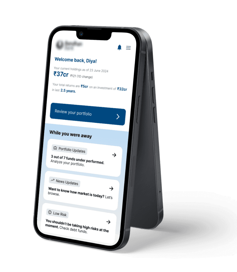
Dashboard Concepts
Approached user’s understanding of mutual funds and built different narratives based on market trends.
What did the client want?
Since they were a retainer client of ScreenRoot, they wanted us to continue building the ecosystem across all their platforms.
Brief
Date-
27 June 2024
Team-
2 UX designer
Why revamp ‘top Indian bank mutual fund portal’?
The existing banking mutual fund portal is outdated, difficult to navigate, and visually unappealing, leading to customer dissatisfaction. The portal's design and functionality do not meet the expectations of today's digitally savvy customers, resulting in a poor user experience. This has negatively impacted the bank's reputation and customer loyalty.
What are we trying to achieve?
We aim to create a more user-friendly and visually appealing portal that enhances the overall user experience, increases customer satisfaction, and strengthens the bank's reputation.
Key Platforms- Banking mutual fund portal
Touchpoint- Main website of the bank
User base
18-30 age group plus the current user base.
Why shift from current user base?
The current user base (65% of users are mainly of age 45 and above from the eastern region of India) is primarily drawn to the bank's secure facilities. However, with shifting trends, a new market of younger users is emerging—ready to transition to modern, PAN-India digital banking.
Target Audience

Audit
These audit metrics steer the focus to usability, consistency, engagement, inclusivity and accessibility for a seamless and user–centric experience.
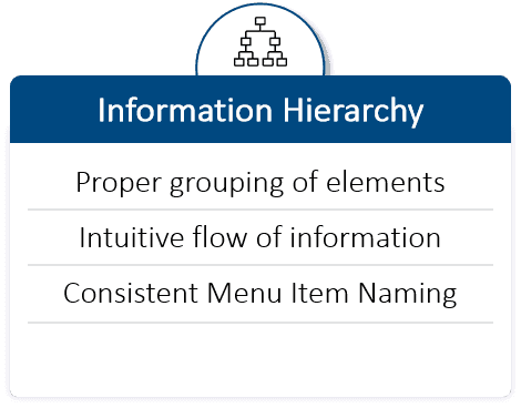
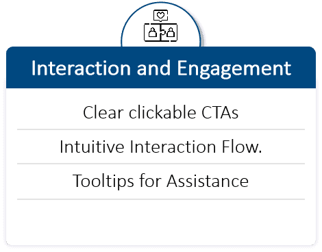
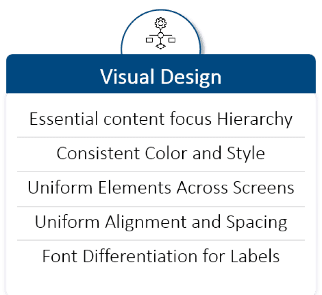
Key Areas of Improvement
#1
Decision making
Incorporate data visualizations, personalized investment recommendations, driving user decision making.
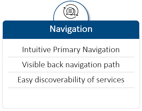
#2
Navigation
Improve navigation with clear, intuitive menus and breadcrumbs.
#3
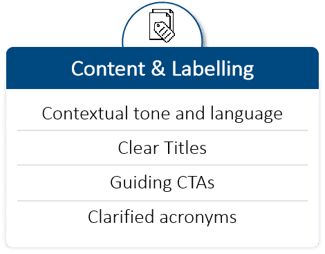
Financial jargon
Replace complex financial terms with user-friendly language while providing tooltips for unavoidable jargon.
#4
Visual layout clutter
Organize content using clear sections and simplify layout to reduce visual clutter.
Benchmarking
We have benchmarked not only the Mutual Funds section of the Bank against other competitors in the market, but we took inspirations for other flows as well-
We took fintech applications (Groww, Coin Zerodha, IND Money) along with a few banks (ICICI) as benchmarks because of clients aim to appear as a PAN India new age digital bank.


#1
Navigation
Relevant quick access point for key and most used products/services.
#2
Fund discovery
Contextual information to enable new users make confident decisions.
#3
Portfolio
Clean, categorized and easy to understand information with contextual benefit nudges.
#4
Fund details
Effective data visualization for key and complex information.
What did we deliver?
We presented them the concepts of dashboard. We received feedback but they are yet to approve one final design.
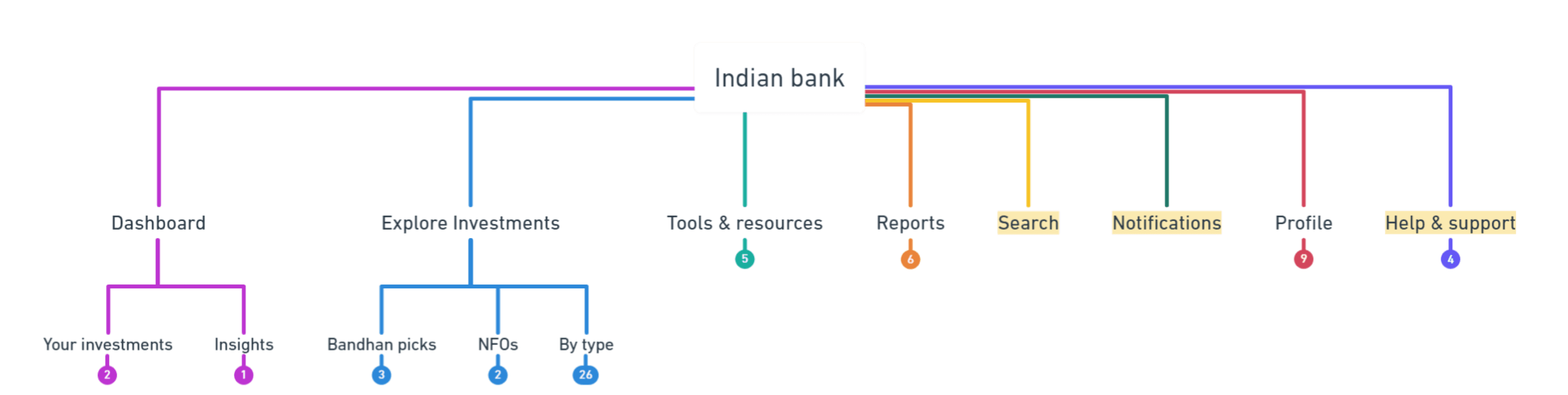
Information Architecture
The User Needs-Based IA focuses on addressing specific investor goals and providing tools and resources tailored to varying levels of investment experience.
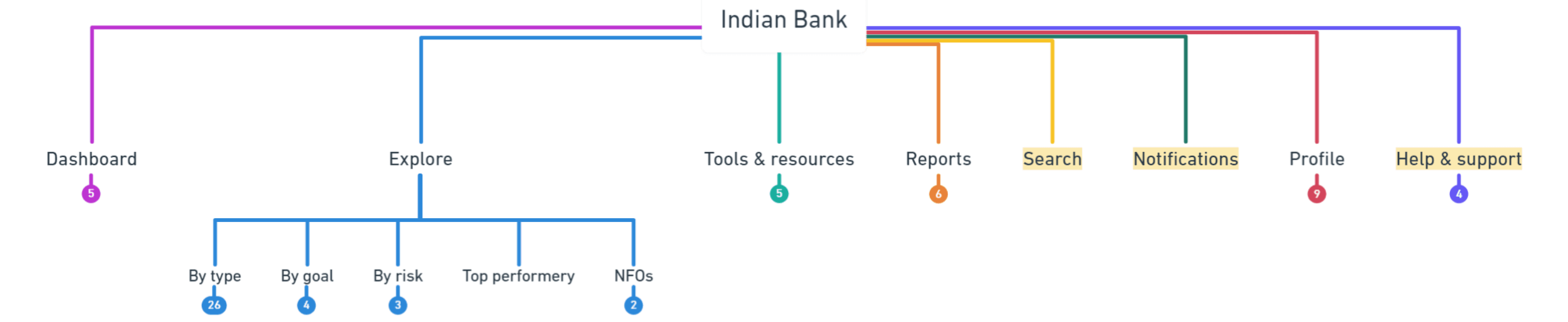
Other than a User need based IA, we gave an option for business pov-based IA as well. But, we recommended the user centric one considering the revamp is to satisfy the customer experience.
Alternate approach
Existing IA
The Business POV-Based IA focuses on addressing specific bank focused funds and providing tools and resources tailored to users while also aligning with the bank’s business goals.
Dashboard Concepts
My focus
Ideation, Conversational approach
Team
5 UX desginers
Note
Approval in progress
Conversational*
Traditional approach
E-commerce
Personalised
This approach uses simple conversations or guided questions to help users make easy decisions for various scenarios (eg- I have ₹100 to invest. Tell me how to get started).Instead of presenting a traditional list of mutual funds, the platform engages users in a dialogue to understand their needs, knowledge, and preferences, then suggests suitable funds.
We want to make investment a conversation and not a headache. This approach uses simple conversations to help users make easy decisions for their requirements. Instead of presenting investments as a complex process, we want to dejargonize and simplify the processes and language to make them at ease with the platform. This will help build retention.
User architypes
First time users, Goal based users, Intermediate users, Expert users
Tone and style
Adapt the tone to be friendly, approachable, and appropriate for the audience's level of expertise.

CTA to review and manage portfolio.
Home, explore and portfolio as global navigation.
Additional explorations:
Since I was working on this project from scratch, mentored by my team lead, I got a chance to explore conversational approach all by myself.
Conversational approach
The focus was to keep the narrative conversational and to act as a financial advisor to all kind of targeted users. While the dashboard concept was being finalized, I continued working to determine if this approach would be adaptable for the entire user base.
About
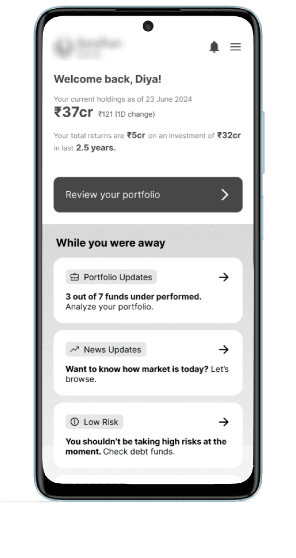
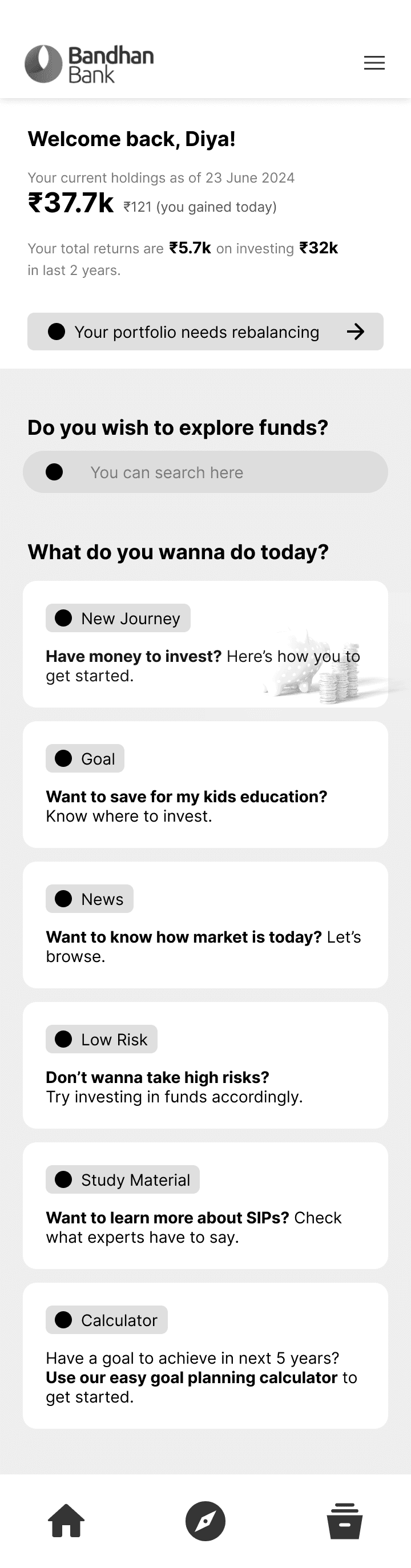
Home screen -
My concept
Explored interrogating conversation with a prioritized search field.
Concise cards covering all potential conversational areas.
The search field is redundant, as the 'Explore' button is prominently placed in the global navigation.
About
Portfolio analysis -
My concept
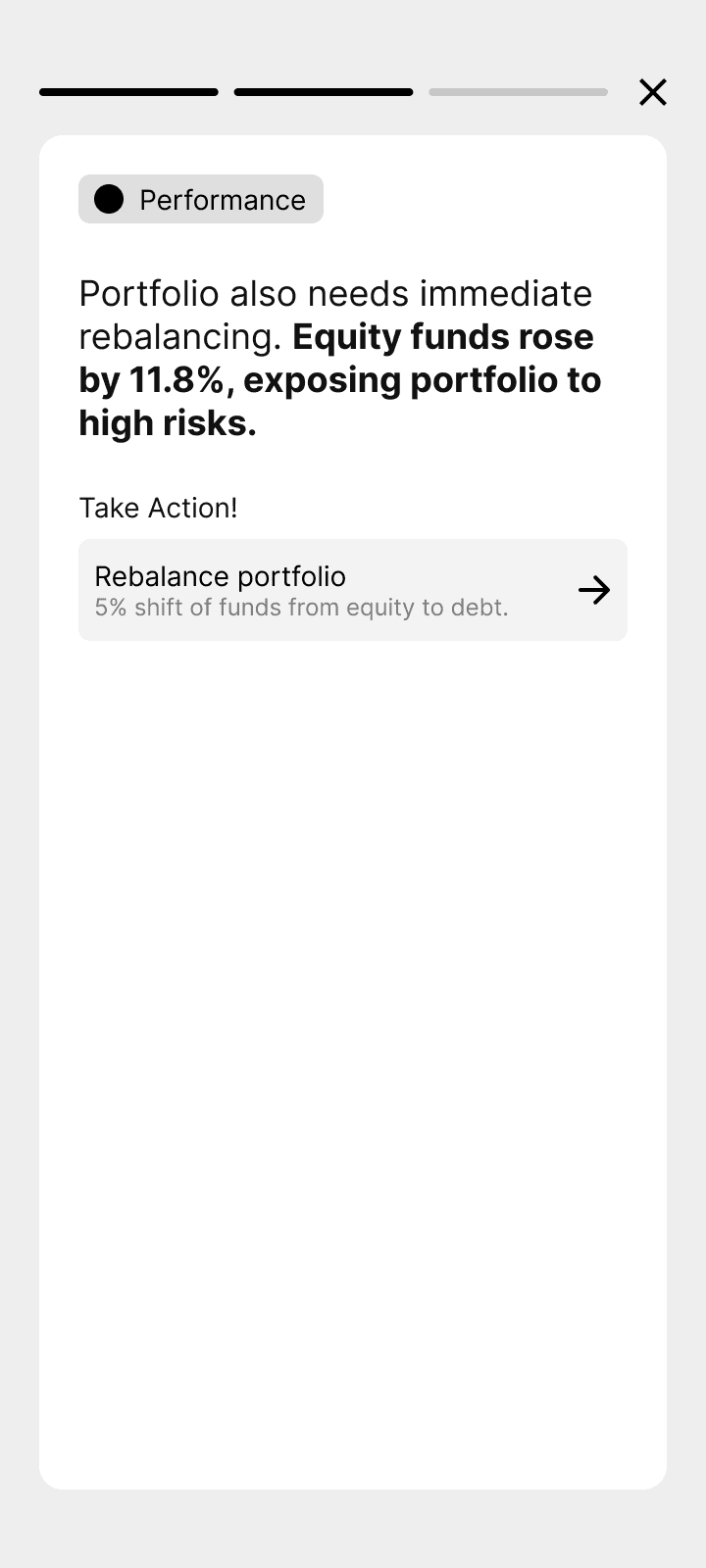
Periodic portfolio analysis presented in a story format with clear CTAs.
Content designed to align with the mental model of frequent social media users, featuring concise and visually hierarchical elements.
Since mutual fund users access the app only once or twice a month, this feature is more suited for stock users.
About
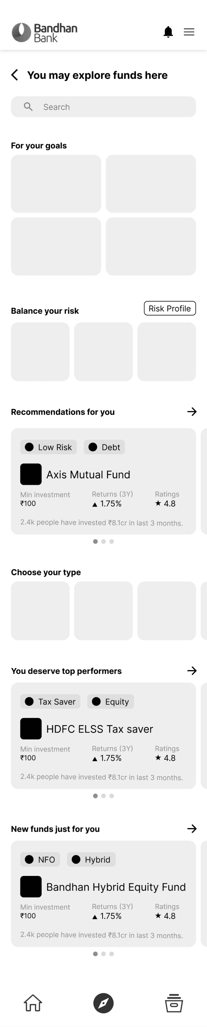
Explore page (low fidelity) -
My concept
Categorized the funds based on user needs and business perspective with relevant CTAs for tools and resources.
Categorization and easy discovery of required funds.
Users' mental model would likely expect this content on the homepage, so accessibility and navigation needs balance!
Possible rendition
This particular thread hasn't been handed over to the UI team yet, but envisioning potential renditions that align with the brand identity, revamped ecosystem and modern UI trends, I explored—

Learnings and Takeaways
Solely audited and benchmarked the mutual fund portal, reviews by my team lead helped me understand the journey of revamping projects.
#1 For audits, recommendations > obvious call outs.
During the auditing stage of the project, I realized that offering solutions alongside identifying areas for improvement is what truly resonates with clients and earns their appreciation.
#2 Explore similar markets when building concepts.
Brainstorming shouldn't be limited to the target market; drawing inspiration from other trends and similar audiences allows designers to create something truly innovative.
#3 Clients always have their favourite benchmarks.
The clients served as users for our design team, bringing their own expectations. We took the time to study and analyze various market applications they saw as goals or competitors.
