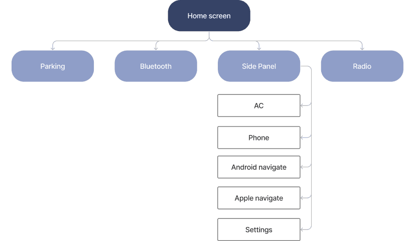
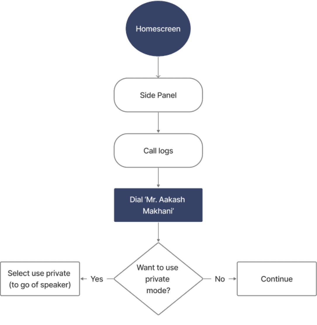
Information Architecture
Since the primary users are elderly people, I kept 3 primary tasks and others as secondary.
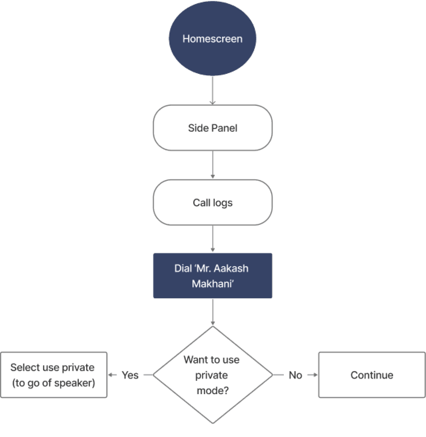
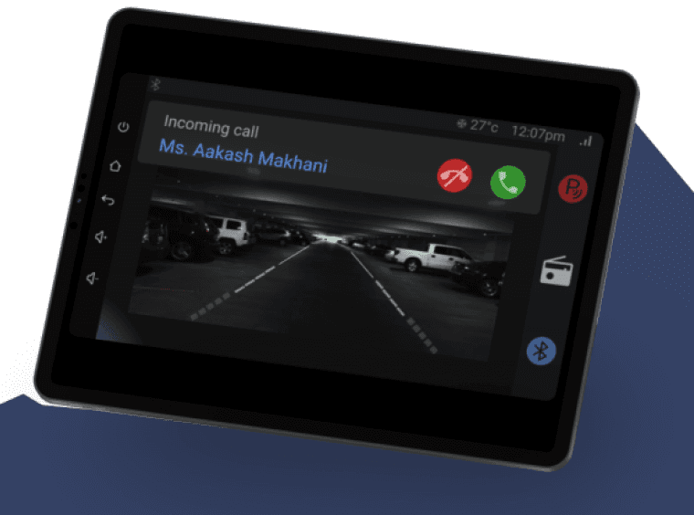
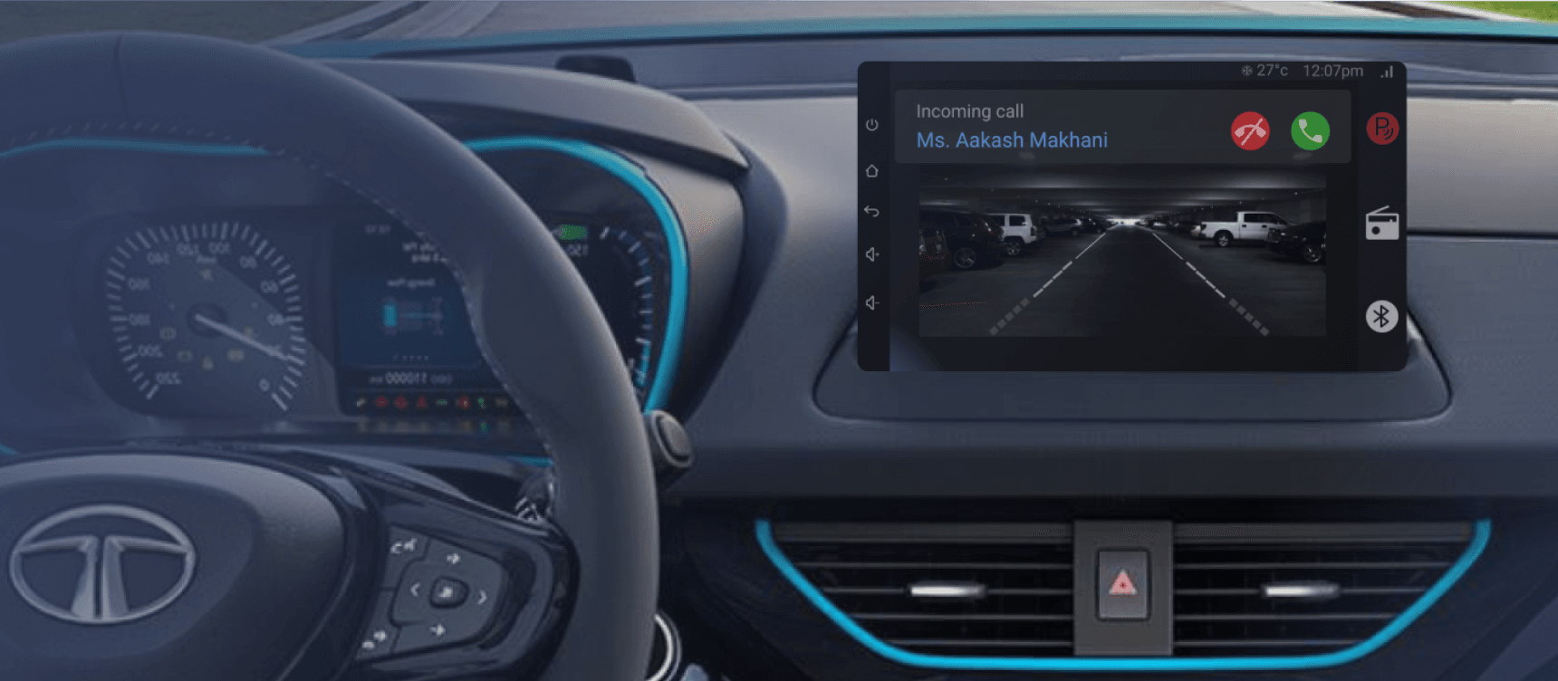
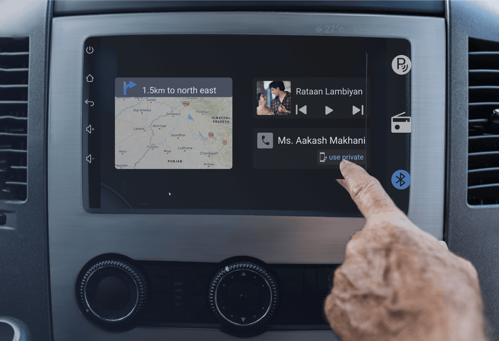
User #1
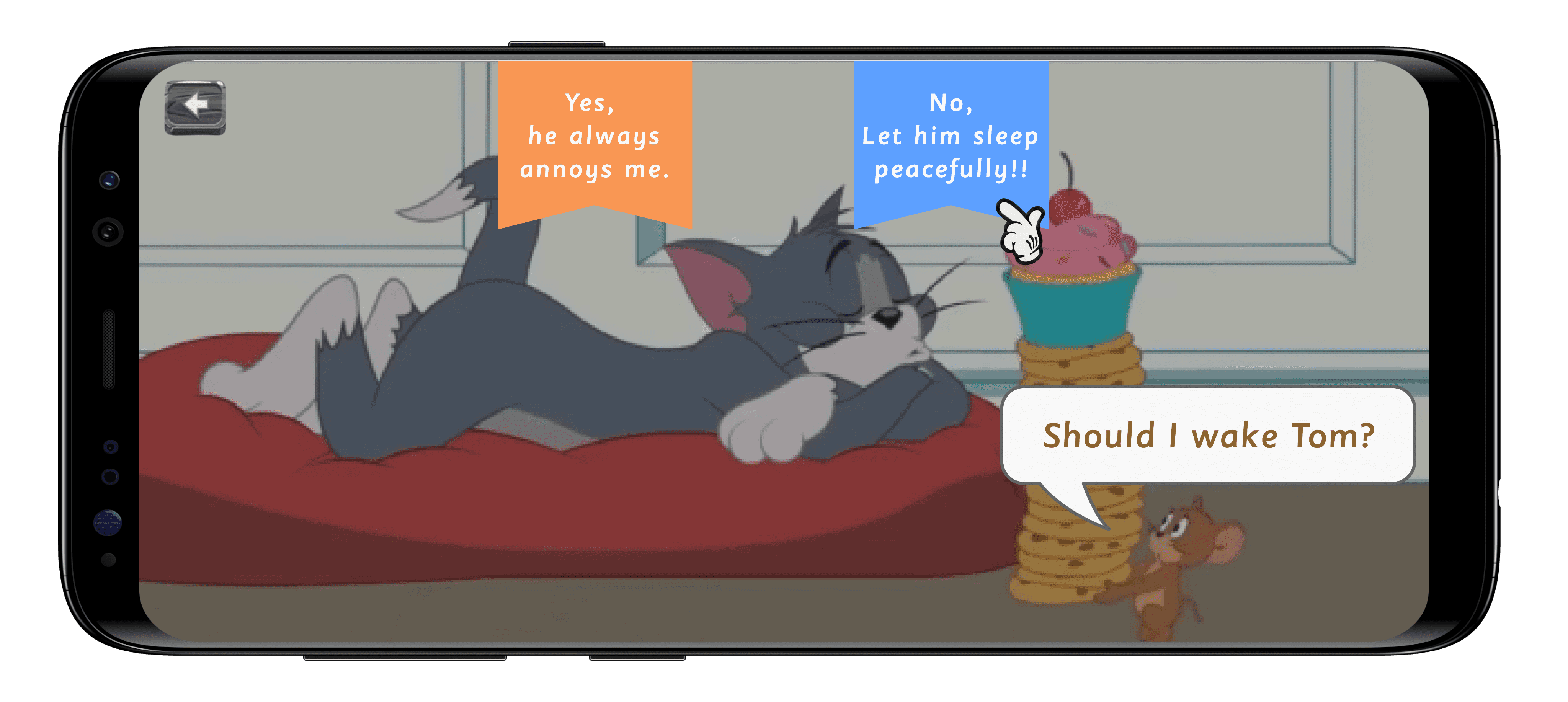
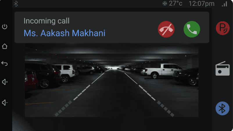
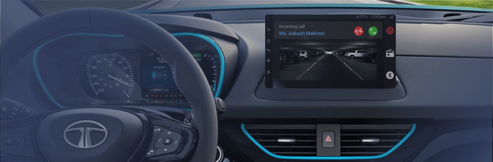
As a weak sighted person, I wish to easily call my client so that I don’t get distracted while driving.
I then mapped out the most common user flow for elderly people.
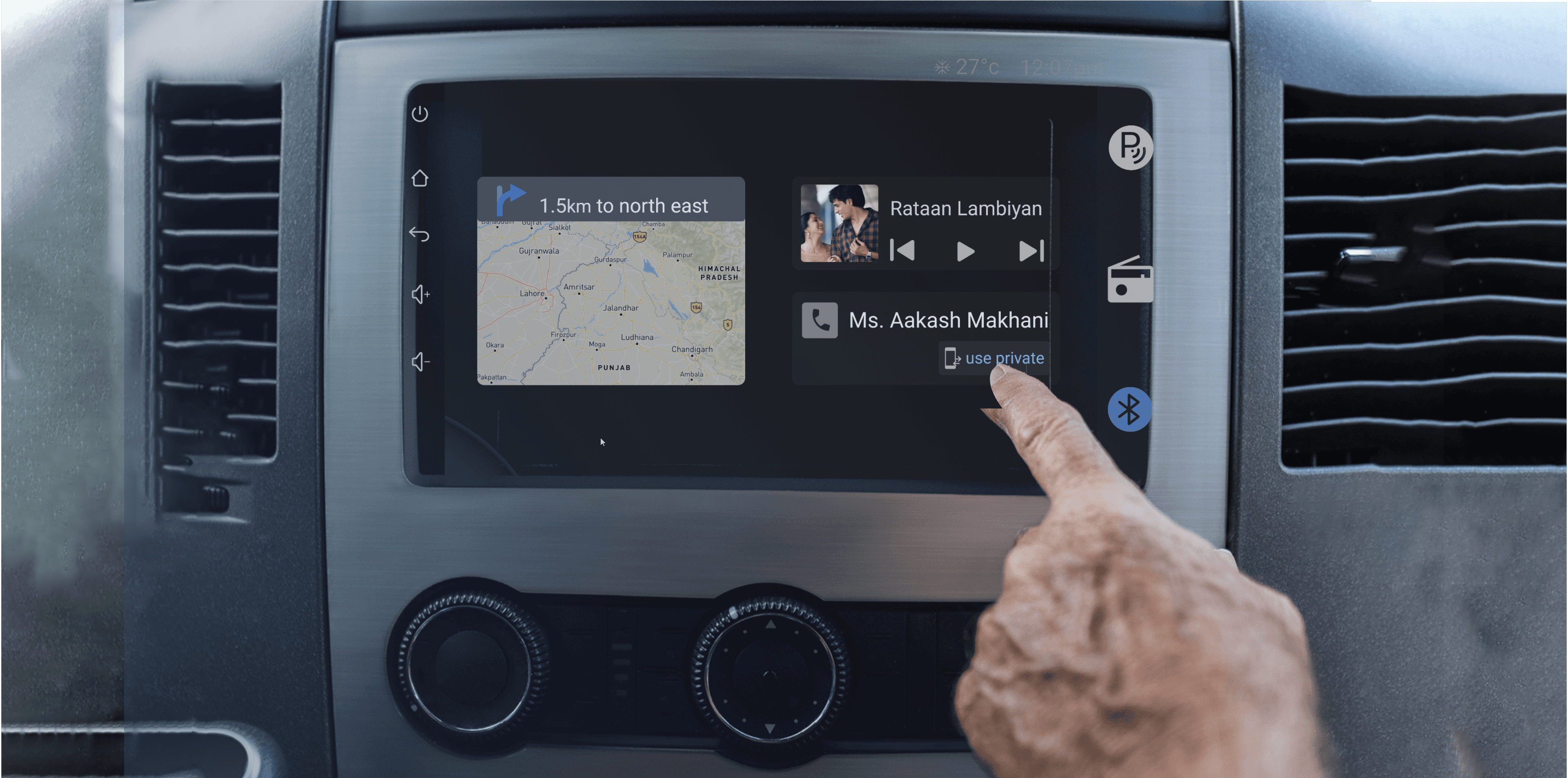
To provide access to the user to all the features in one go, that too at a radius of a finger, aligns with ergonomic principles.
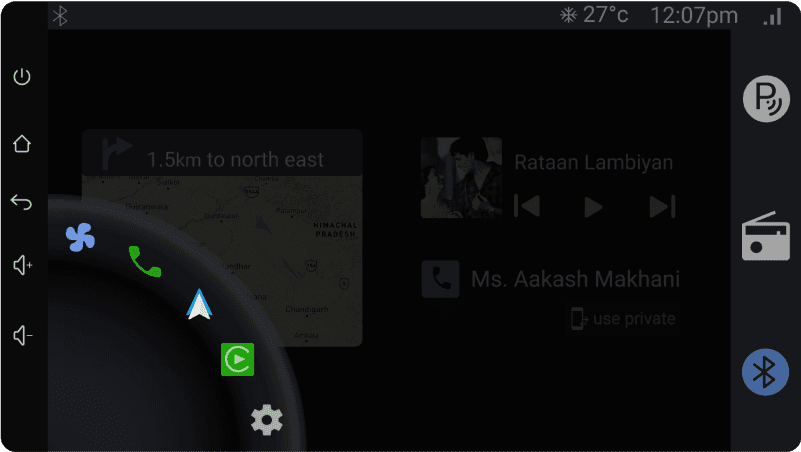
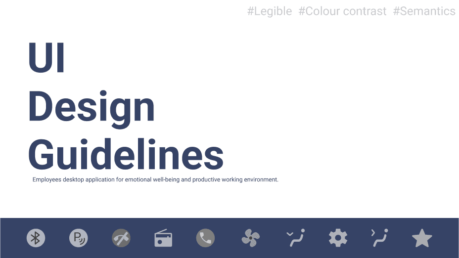
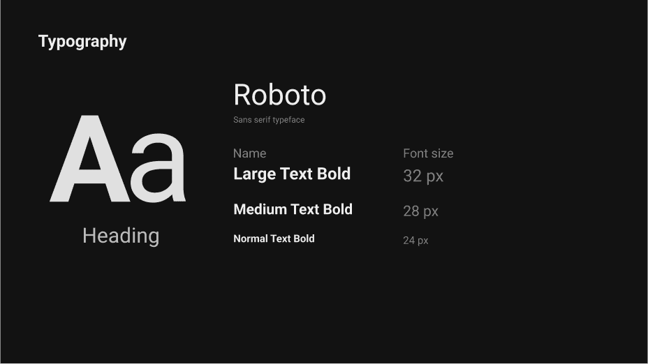
To let the user read the main information at one glance, primary colour and text hierarchy has been followed.
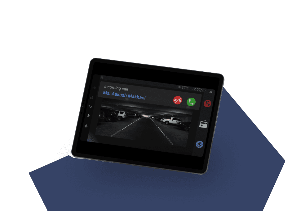
To ease the reverse parking process during high cognitive load- colour hierarchy and line patterns were followed.
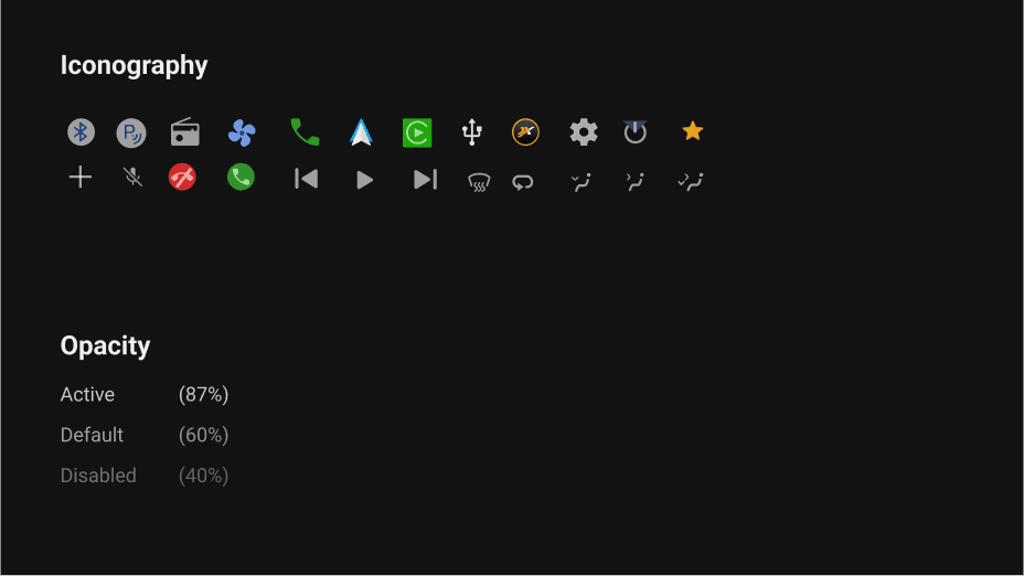
Additionally, pop-up icons have been modified slightly from the usual ones. This aims to enhance information conveyance when visual attention is occupied.

Keeping in mind the user base, designed the simplest architecture possible.
Let’s develop the solution:
After my wireframes were complete, I conducted usability testing with 3 users in order to obtain practical, real-time feedback to improve the design and provide a more optimal user experience.
Testing and Iterations
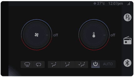
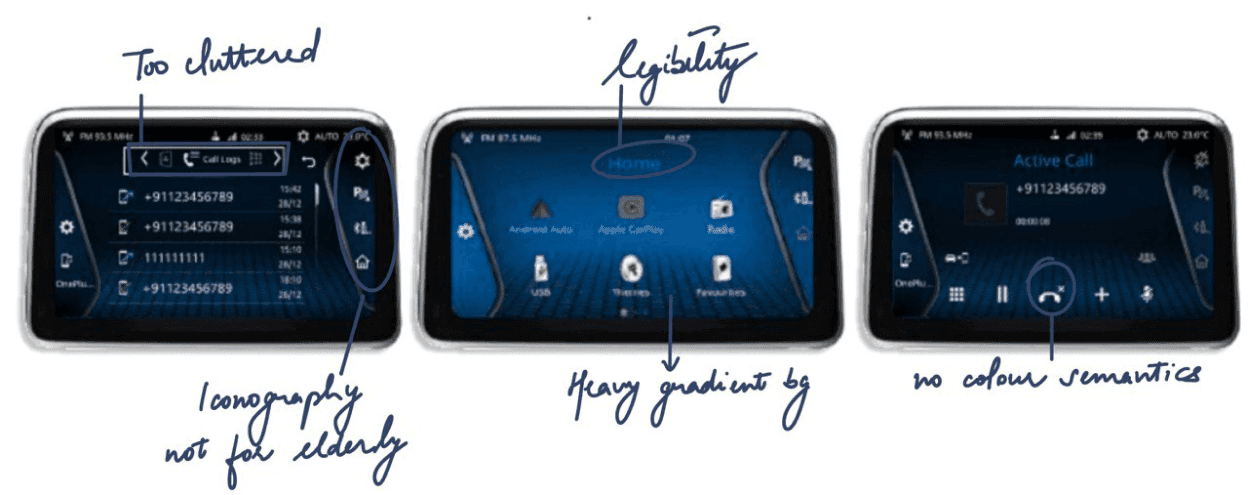
Changed the visuals, to increase accessibility of AC screens.
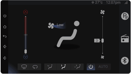
Before
After
Parent #2
“Which side to rotate to increase the temperature?”
Improved the gradient effect, to make it more intuitive design.
Before
After
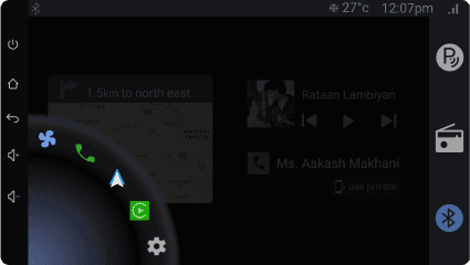
USER #1
“Oh, is the screen broken from here?”
Infotainment screens
News
Movies
Music
INTERESTS
Independency
Car screens
Technology
Retro songs
LIKINGS (for kids)
Rich
Aware
Busy
Patient
Middle class
Not much
Time Rich
Impatient
PERSONALITY
Money concerned
Not tech savvy
Not aware of trends
TRAIT 1:
TRAIT 2:
TRAIT 3:
ABOUT
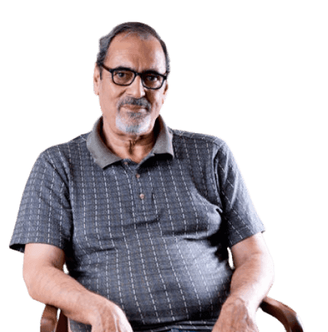
Ramesh is a businessman. Sometimes, he needs to travel to Gurgaon for work purposes. He doesn’t self drive much but when it is necessary, his weak eyesight becomes an issue. Also he feels the infotainment screen is way too complicated for him to understand and use.
NEEDS
Simpler infotainment screenws
More relevant icons for inclusivity.
Larger font size, please!!
NEEDS
Simpler infotainment screenws
More relevant icons for inclusivity.
Larger font size, please!!
FRUSTRATIONS
Too much time consumed on simpler tasks.
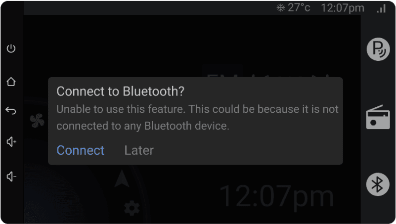
Unable to remember how to connect to bluetooth.
Can’t recognize icons sometimes.
Ramesh Kumar
55 years old
Delhi, India
Ek toh gaadi km chalata hu, upper se chalao toh yeh dibba samajh nahi aata. Reversing camera tkk nahi smjh aata.”
Issues elder people face while interacting with screens.
Let’s dive into the Research:
Interviews
10+
Types
Open ended (In person) and observational
Platform
Telephone and In person
Interviews and surveys
Treatments to cure elderly exclusivity
Insight #1
Depth of task flow
Complex menu distracts drivers while driving, risking accidents. They should be shallow, allowing tasks to be completed quickly.
Insight #2
Visual demand
Optimal touch target sizes and contrast for seamless interaction, strike a balance between visual demand and usability.
Insight #4
Haptic feedback
Current touch-screen devices lack tactile feedback, requiring attention away from the road to ensure task completion.
Insight #3
Recognizing symbols
Picking suitable colours for display enable to read and recognize symbols without delay. This reduces the risk involved.
People ignore design that ignores people.”
- Frank Chimero, Designer
“
Drivers should finish a task in quick 1.5-second glances, limiting total time away from the road to 12 seconds. Navigating interfaces poses a tale of challenges for older users resulting in prolonged and less successful task completion such as-
How are elderly people ergonomically affected with screens?
Small font size causes legibility issues.
Content placement increases cognitive load.
Memory recall for larger contents complicates the task.
Lack of physical space leads to incorrect clicks.
Challenging menu navigation increases mental workload.

Why is inclusivity necessary for elderly population ?

“Oh! I made a mistake again.”
“What just happened?”
“I wasn’t opening this.”
“I can’t do this.”
“But I clicked on call logs.”
#1
Simplify the flow of information within menus to reduce distraction.
Designing menus with limited depth allow users to complete secondary tasks in a relatively short time period.
#2
Reduce visual demand and improve usability of icons specific to elderly people.
Touch targets need to be large enough in order to minimise task completion time and error rate.
#3
Improve the colourful display to recognize symbols at one glance.
Picking distinctive brightness contrasts, less colourful to improve legibility for senior people.
#4
Provide control since user’s eyes are always on road.
Equip touch devices with haptic feedback to increase performance and reduces operation time.
How might we
Reframing the challenges turned them into opportunities for design.
Problem solving
Analyzed additional infotainment displays for improved guidance.
Reference from a consumer car
For this project, I referred to the infotainment screen of a consumer based car with economy buyers.
This is not a redesign, rather a reference.
Note
Overview
An inclusive In-vehicle infotainment (IVI) system, prioritizing visual- cognitive ergonomics for elderly. It addresses issues in the current interfaces, leading to safety concerns. It evaluates the discomfort faced by the targeted users like mental load, visual demand and legibility discomfort.
Problem
The current UI design in vehicles is widely criticised by elderly people for high cognitive demand. This also results in safety concerns.
Reason
IVI system distracts driver from the primary task. The current trend tends to reduce the controls. Groups them into multi-functional knobs and complicating overall performance.
Approach
Evaluating the layout with the least possible distractions and discomforts. Choosing inclusive icons for elderly people.
Focus
User research, Ergonomics, UI (Figma), Usability testing
Duration
1.5 week (32 hours)
Sector
Inclusivity, Infotainment screen
DEFINE
Problem Space
Overview
RESEARCH
Product study
Statistics
User Research
Insights
DESIGN
Design System
High Fidelity Prototype
Features
Usability Testing
IDEATE
How might we
Existing Product


Background
I studied challenges faced by elderly people when using screens and realised how non-inclusive it is designed for them.
Driving IVI systems towards elderly inclusivity
Submitted at-

#1 Iconography*semantics
In the world of elders, icons and meanings share a dance. Their meaning to an icon might be different from the current trends. Clear iconography aids understanding, enriching their digital experiences.
#2 Usability testing is king
Graphical design might look different on actual device, considering it’s screen size, usability area. So, always be open for iterations at usability stage.
Learnings and Takeaways
I'm happy that I was able to work on a project for elderly, because it was different than my other projects.
Driving IVI systems towards elderly inclusivity

Submitted at-
Focus
User research, Ergonomics, UI (Figma), Usability testing
Duration
1.5 week (32 hours)
Sector
Inclusivity, Infotainment screen
Overview
An inclusive In-vehicle infotainment (IVI) system, prioritizing visual- cognitive ergonomics for elderly. It addresses issues in the current interfaces, leading to safety concerns. It evaluates the discomfort faced by the targeted users like mental load, visual demand and legibility discomfort.
Background
I studied challenges faced by elderly people when using screens and realised how non-inclusive it is designed for them.
Problem
The current UI design in vehicles is widely criticised by elderly people for high cognitive demand. This also results in safety concerns.
Reason
IVI system distracts driver from the primary task. The current trend tends to reduce the controls. Groups them into multi-functional knobs and complicating overall performance.
Approach
Evaluating the layout with the least possible distractions and discomforts. Choosing inclusive icons for elderly people.
What, why and how has kids behaviour changed with the shift from traditional to digital games.
Let’s dive into the Research:
Drivers should finish a task in quick 1.5-second glances, limiting total time away from the road to 12 seconds. Navigating interfaces poses a tale of challenges for older users resulting in prolonged and less successful task completion such as-
Elderly people ergonomically
affected with screens.
Lack of physical space leads to incorrect clicks.

Memory recall for larger contents complicates task.

Content placement increases cognitive load.

Challenging menu navigation leads to mental workload.

Small font size causes legibility issues.

Interviews
10+
Types
Open ended (In person) and observational
Platform
Telephone and In person
Interviews and surveys
Cure elderly exclusivity
Insight #1
Depth of task flow
Complex menu distracts drivers while driving, risking accidents. They should be shallow, allowing tasks to be completed quickly.
Insight #2
Visual demand
Optimal touch target sizes and contrast for seamless interaction, strike a balance between visual demand and usability.
Insight #3
Recognizing symbols
Picking suitable colours for display enable to read and recognize symbols without delay. This reduces the risk involved.
Insight #4
Haptic feedback
Current touch-screen devices lack tactile feedback, requiring attention away from the road to ensure task completion.
Problem solving
Root Cause Analysis design strategy was approached for positive user experience.
Keeping in mind the user base, designed the simplest architecture possible.
Let’s develop the solution:
Information Architecture
I then mapped out the most common user flow for elderly people.
Infotainment screens
To provide access to the user to all the features in one go, that too at a radius of a finger, aligns with ergonomic principles.
To ease the reverse parking process during high cognitive load- colour hierarchy and line patterns were followed.
Additionally, pop-up icons have been modified slightly from the usual ones. This aims to enhance information conveyance when visual attention is occupied.
To let the user read the main information at one glance, primary colour and text hierarchy has been followed.
I'm happy that I was able to work on a project for elderly, because it was different than my other projects.
Learnings and Takeaways
#1 Iconography*semantics
In the world of elders, icons and meanings share a dance. Their meaning to an icon might be different from the current trends. Clear iconography aids understanding, enriching their digital experiences.
#2 Usability testing is king
Graphical design might look different on actual device, considering it’s screen size, usability area. So, always be open for iterations at usability stage.
DEFINE
Problem Space
Overview
RESEARCH
Product study
Statistics
User Research
Insights
DESIGN
Design System
Hi-Fi Prototype
Features
Usability Testing
IDEATE
How might we
Existing Product


Inclusivity for elderly population ?
People ignore design that ignores people.”
- Frank Chimero, Designer
“
“What just happened?”
“I wasn’t opening this.”
“I can’t do this.”
“But I clicked on call logs.”
“Oh! I made a mistake again.”
ABOUT
Ramesh is a businessman. Sometimes, he needs to travel to Gurgaon for work purposes. He doesn’t self drive much but when it is necessary, his weak eyesight becomes an issue. Also he feels the infotainment screen is way too complicated for him to understand and use.
NEEDS
Simpler infotainment screenws
More relevant icons for inclusivity.
Larger font size, please!!
NEEDS
Simpler infotainment screenws
More relevant icons for inclusivity.
Larger font size, please!!
FRUSTRATIONS
Too much time consumed on simpler tasks.
Unable to remember how to connect to bluetooth.
Can’t recognize icons sometimes.
Ramesh Kumar
55 years old
Delhi, India
Ek toh gaadi km chalata hu, upper se chalao toh yeh dibba samajh nahi aata. Reversing camera tkk nahi smjh aata.”
Reference from a consumer car
For this project, I referred to the infotainment screen of a consumer based car with economy buyers.
This is not a redesign, rather a reference.
Note
#1
Simplify the flow of information within menus to reduce distraction.
Designing menus with limited depth allow users to complete secondary tasks in a relatively short time period.
#2
Reduce visual demand and improve usability of icons specific to elderly people.
Touch targets need to be large enough in order to minimise task completion time and error rate.
#3
Improve the colourful display to recognize symbols at one glance.
Picking distinctive brightness contrasts, less colourful to improve legibility for senior people.
#4
Provide control since user’s eyes are always on road.
Equip touch devices with haptic feedback to increase performance and reduces operation time.
How might we
Reframing the challenges turned them into opportunities.
User #1
As a weak sighted person, I wish to easily call my client so that I don’t get distracted while driving.
After my wireframes were complete, I conducted usability testing with 3 users in order to obtain practical, real-time feedback to improve the design and provide a more optimal user experience.
Testing
Before
After
USER #1
“Oh, is the screen broken from here?”
Improved the gradient effect, to make it more intuitive design.
Before
After
Parent #2
“Which side to rotate to increase the temperature?”
Changed the visuals, to increase accessibility of AC screens.