Routing on tyres, the crosstrails
My focus
UX research and wireframes
Duration
4 weeks (60 hours)
Sector
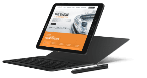
Tyre manufacturing industry
Overview
This micro-website initiative aimed to elevate our client's brand as a leader in adventure travel. By curating inspiring content, providing practical tools, and fostering a vibrant community, we created a digital platform that empowered riders to explore, connect, and experience the thrill of the open road.
Background
This was my first project at ScreenRoot, where I attended client review meetings and was mentored by a senior designer.
DEFINE
Overview
RESEARCH
Client brief
Market Research
constraints
DELIVER
Wireframes delivered to UI team.
DESIGN
information architecture
wireframes
Microcopy


Brief
Positioning a leading tyre manufacturing company, as an inspirational force in the exploration community.
Challenge
The ask was for a microsite within a tight budget and time limiting the scope of the project.
Outcome
With the power of digital storytelling, a platform that would curate handpicked itineraries and inspiring stories.
What did the client want?
The client's SPOC was proactive and understanding, providing clear and timely feedback that allowed us to design the website efficiently. Kudos to her!
Brief
Date-
12 June 2024
Team-
2 UX designers
Why is there a need for "Crosstrails" by India's leading tire manufacturing company?
As the Indian market is evolving and people are traveling far and wide in their bikes and groups as Individual and couples and groups , we want a create a platform that gives the explorers access to them to be inspired, to research, to plan, to discuss and to head out and experience the world around them.
What are we trying to achieve?
We want to position us as an inspirational brand through exploration content and create a Premium imagery for the brand and a loyal community that can act as promoters for the brand. We want to engage with our consumers through engaging content, democratized access to information, curated tours and tour planning, organise drives and expeditions and partner with community leaders to give access to users to new experiences.
Key Platforms- New Instagram handle, Our YouTube Page, Our Website – Dedicated Section
Partners- Auto Media Journalist, Shoppe touchpoint, Social media Influencers, UGC
User base
18 – 45 Years • Male and Female • Lifestyle/Travel/Auto Enthusiasts
Target Audience

Saumya Bandyopadhyay
As an armchair traveller,
I want to look at travel vlogs
So that I can socially engage.
Vishnu Bhosale
As an constrained traveller,
I am looking for curated trips
So that I can actively travel.

Laveena Dangi
As an explorer,
I am interested in itineraries
So that I can go on epic journeys.
In market trends


What did we deliver?
According to the project plan, we finalized the IA within three days of the client brief and then began working on the homepage sections.
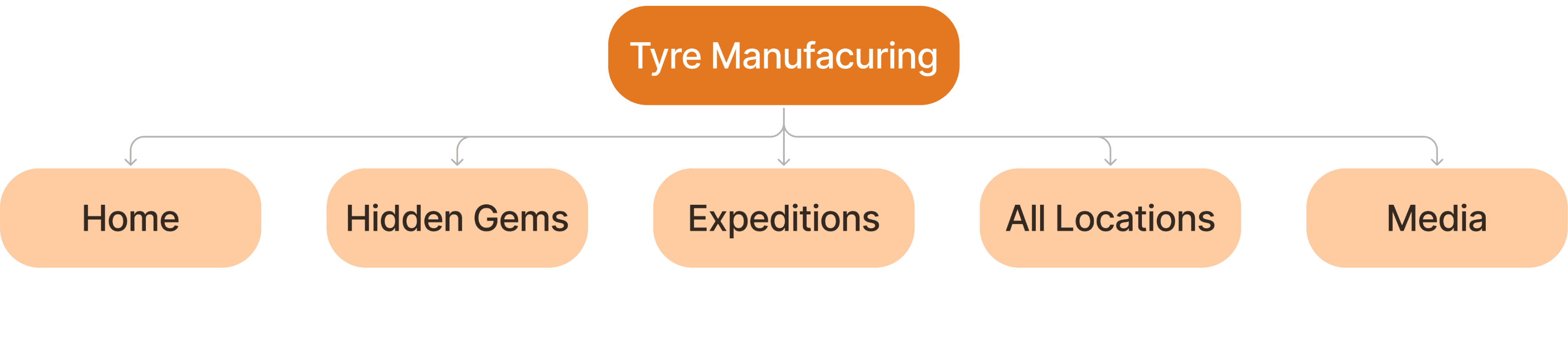
Information Architecture
As it was a microsite, key page touchpoints were requested to remain on the homepage and upfront in the global navigation.
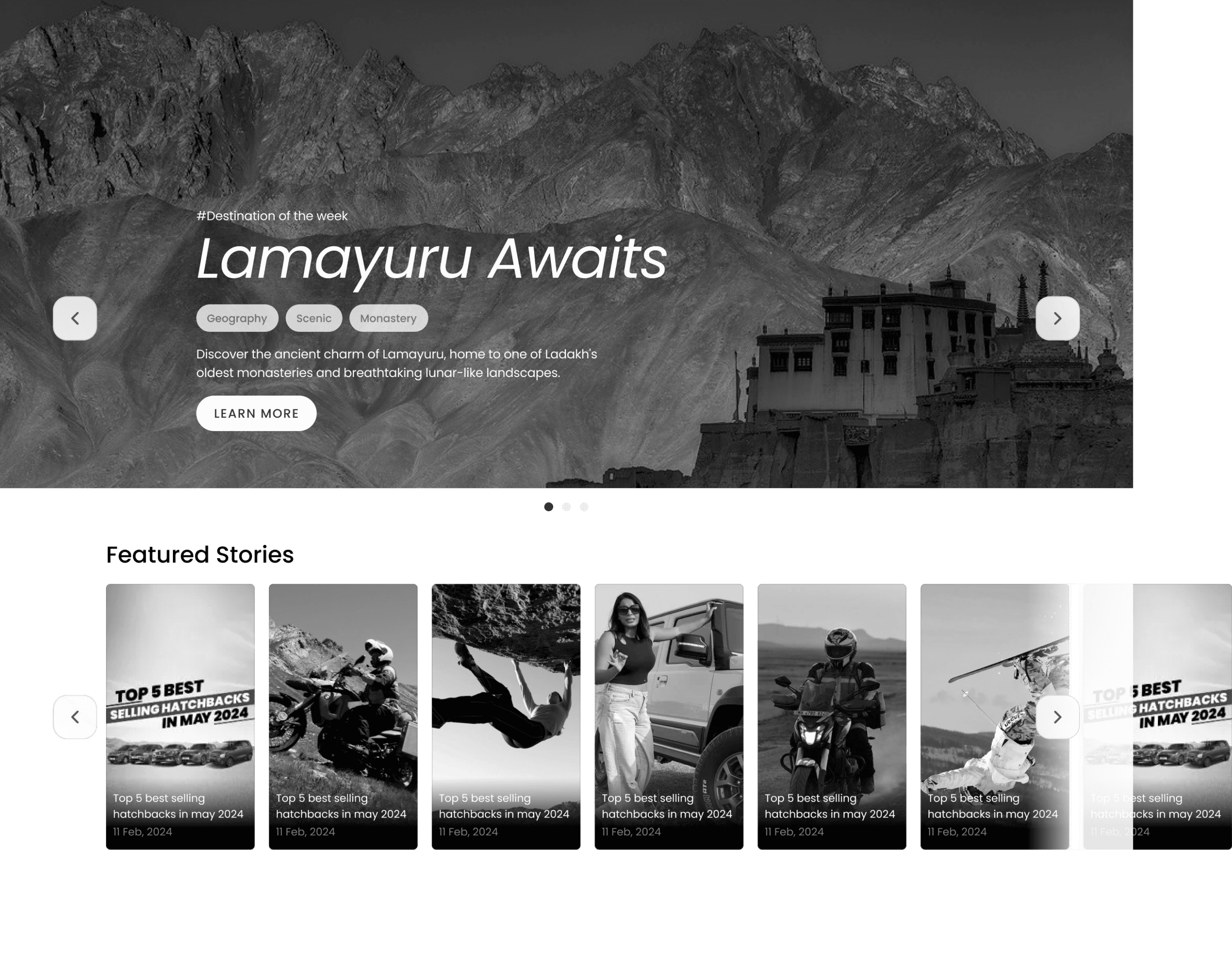
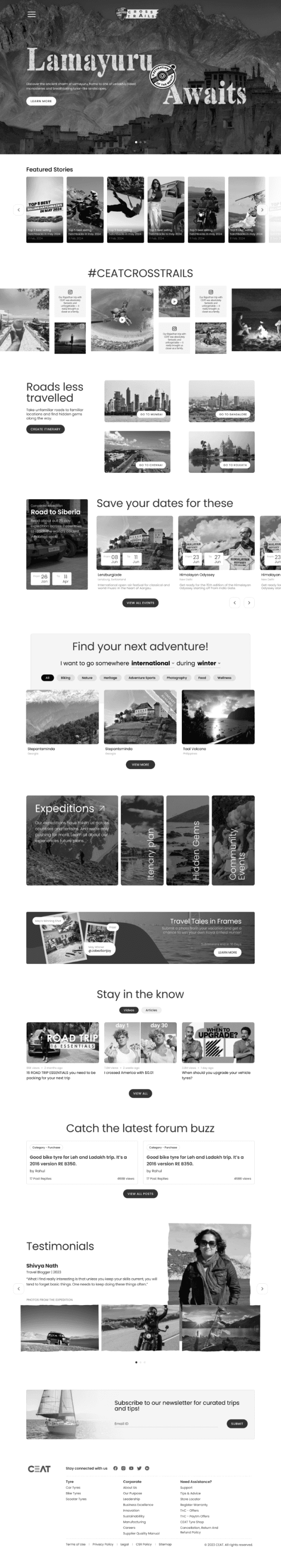
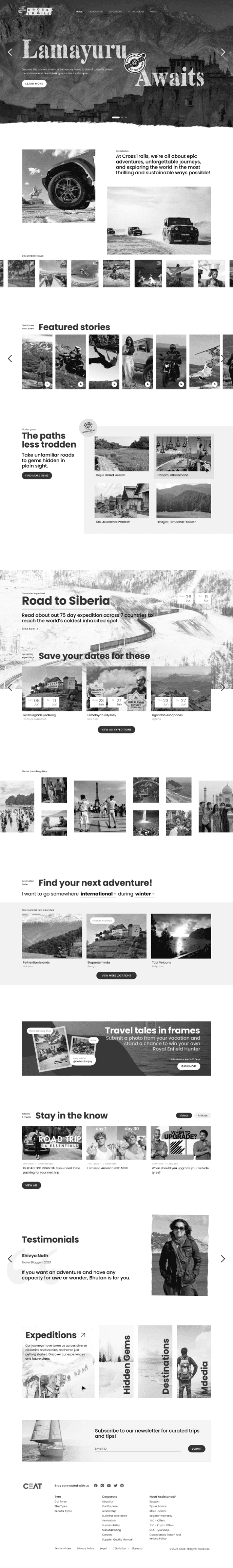
Homepage iterations
Given the flexibility to structure the homepage, we prioritized the content into sections and included CTAs directing users to relevant inner pages.
Template - based website
We brainstormed potential templates that could accommodate all types of content with minimal development effort. A minimum of three pages were required, which could be modified based on content needs.
Homepage
Listing template
Product detail template
As we were developing a microsite, we categorized the content upfront into section folds and included CTAs directing users to relevant inner pages.
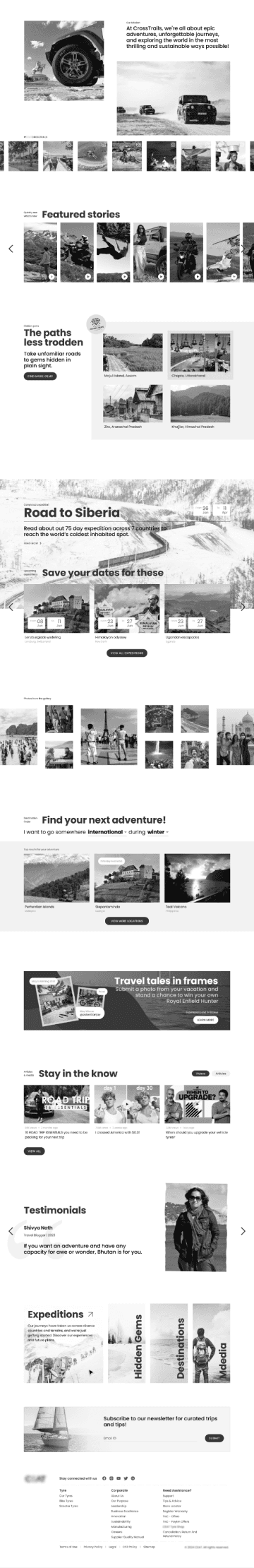
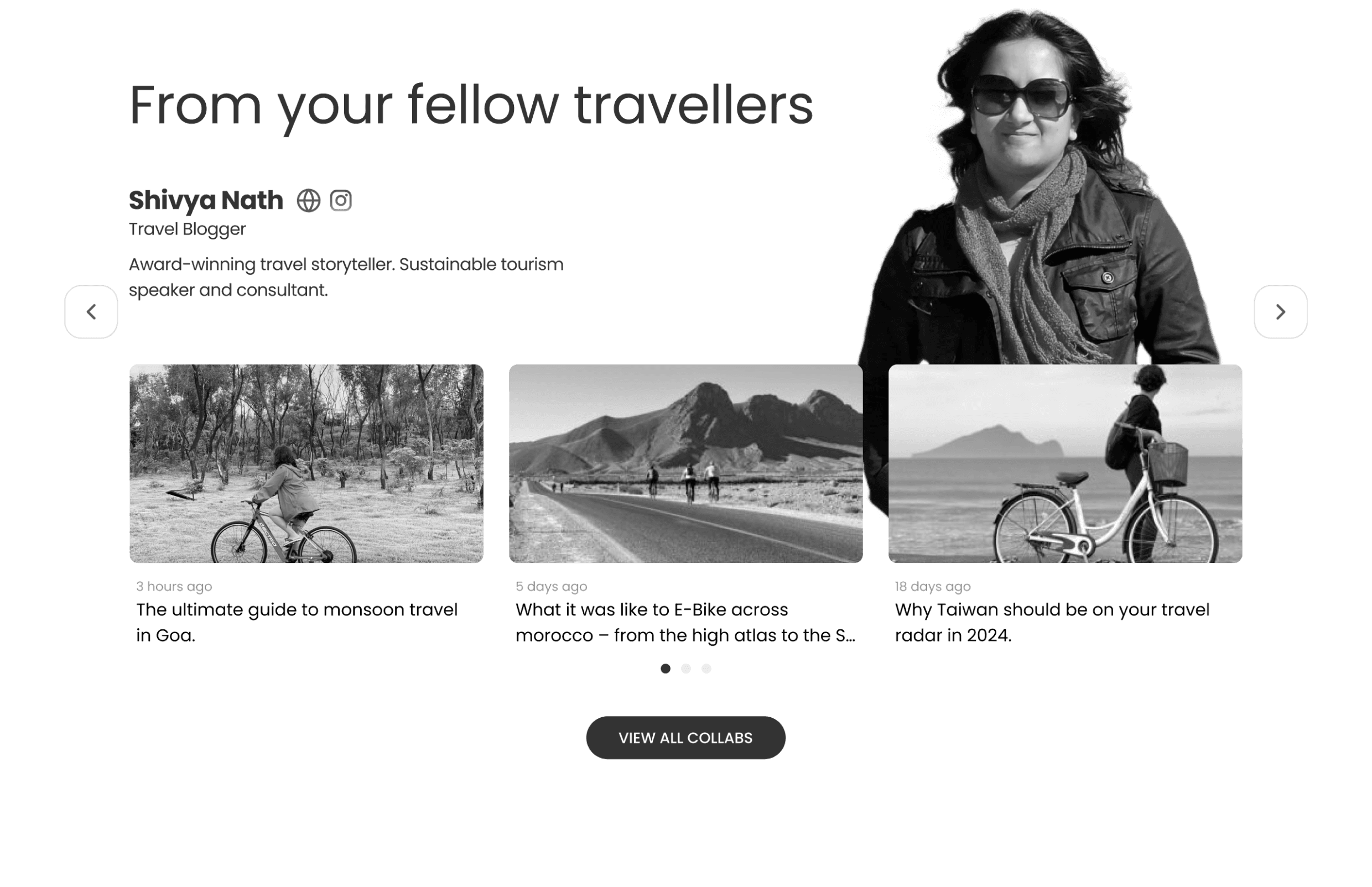
An Instagram feed section, given the focus on social media influencers.
Users can discover hidden gems here.
Help users engage and plan their next adventure.
Organizing photography contests to keep the user engaged with incentives.
Testimonials from social media collaborators to build trust.
Direct touchpoints for various events accessible to users.


Additional explorations:
As a designer, I explored alternative renditions beyond the approved designs, which helped me learn to tailor wireframes to the client's requirements.
The entire website is component-based, and due to the numerous content categories—such as itineraries, hidden locations, activities, and planned expeditions—I explored various methods to present all of this information clearly.
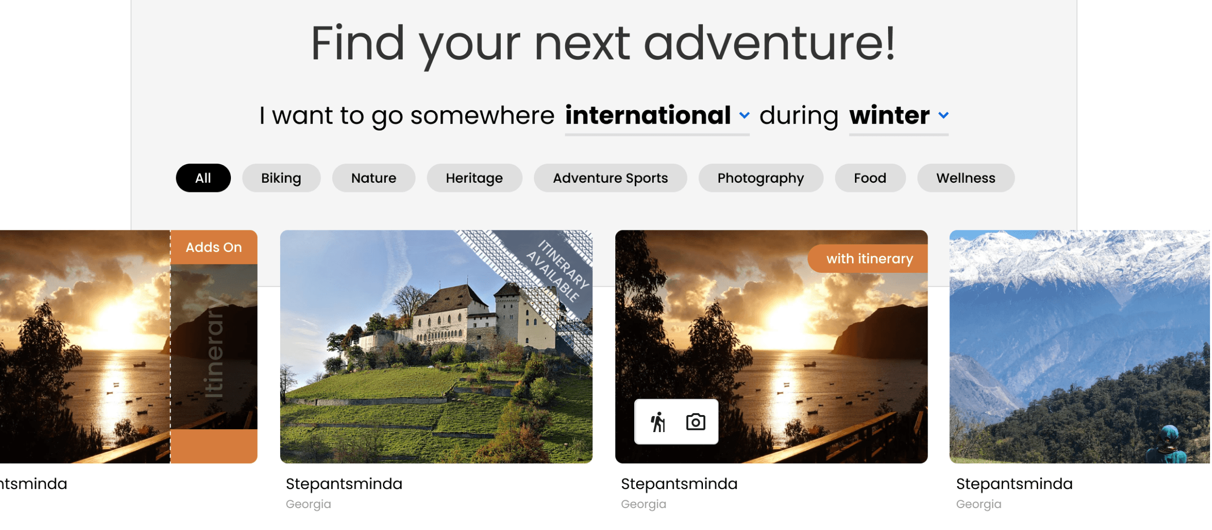
About
Cards for destinations, featuring various add-ons.
My concept
I had a few renditions in my mind for cards to showcase the add ons of the inner pages.
Clear indication of the content of the detailed page.
Customisation and such iconography is out of scope.
About
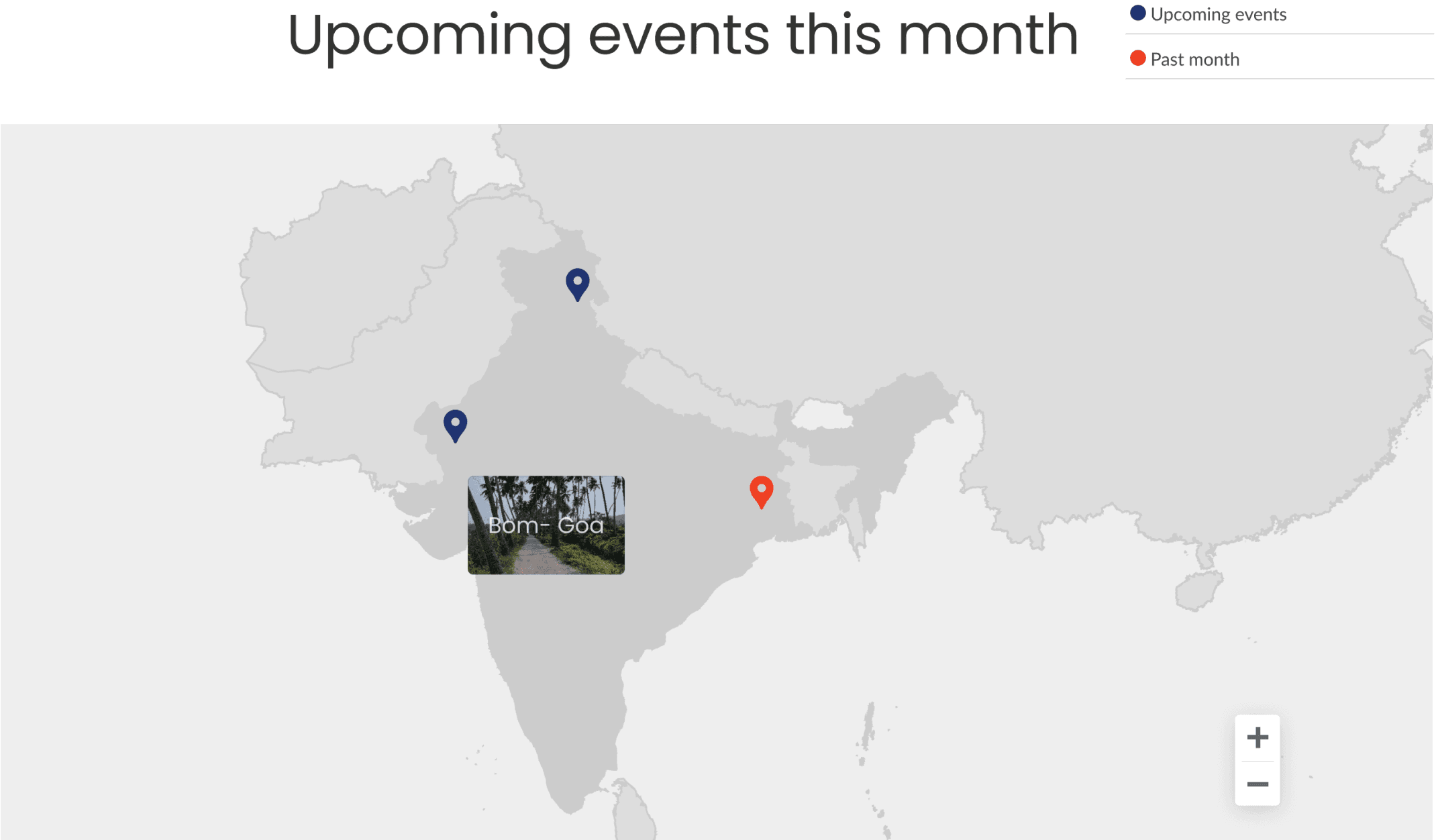
A section on the homepage dedicated to expeditions planned by the client worldwide.
My concept
An interactive map featuring color-coded events to indicate past and upcoming activities.
Engagement for users
Clients didn’t have quantified content for such sections, thus out of scope.
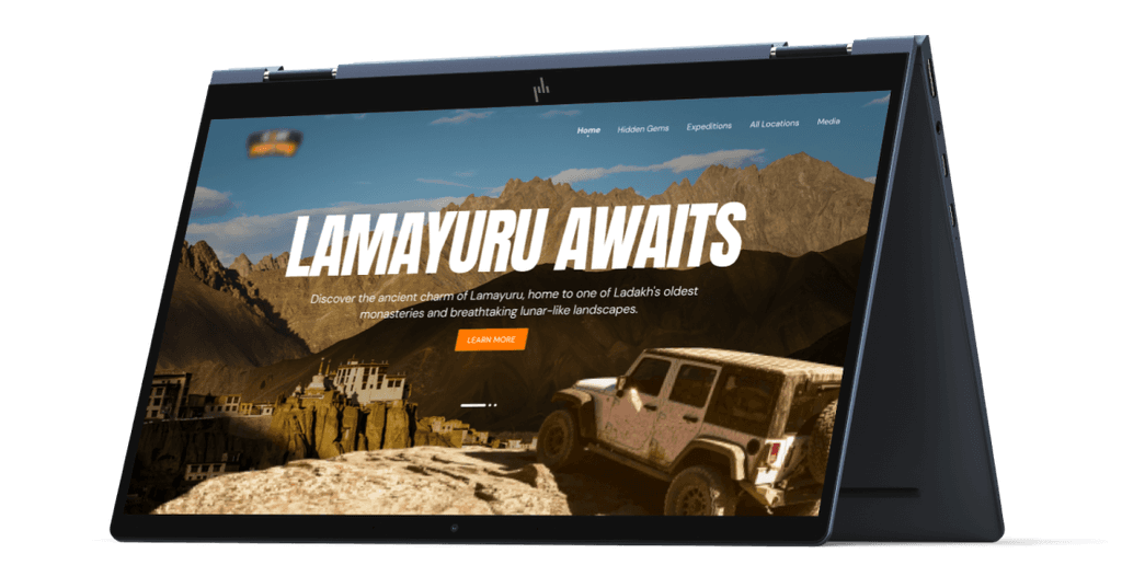
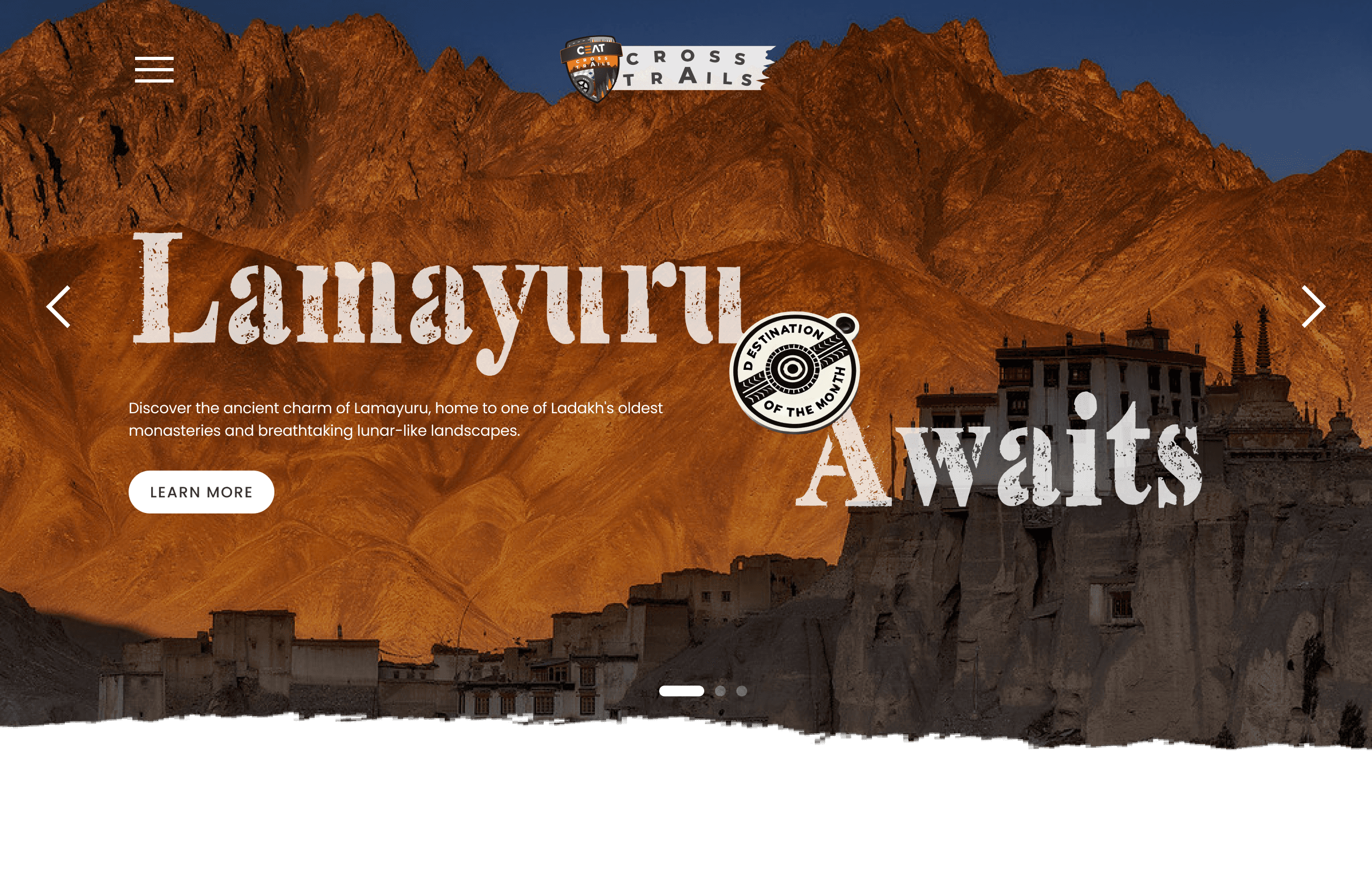
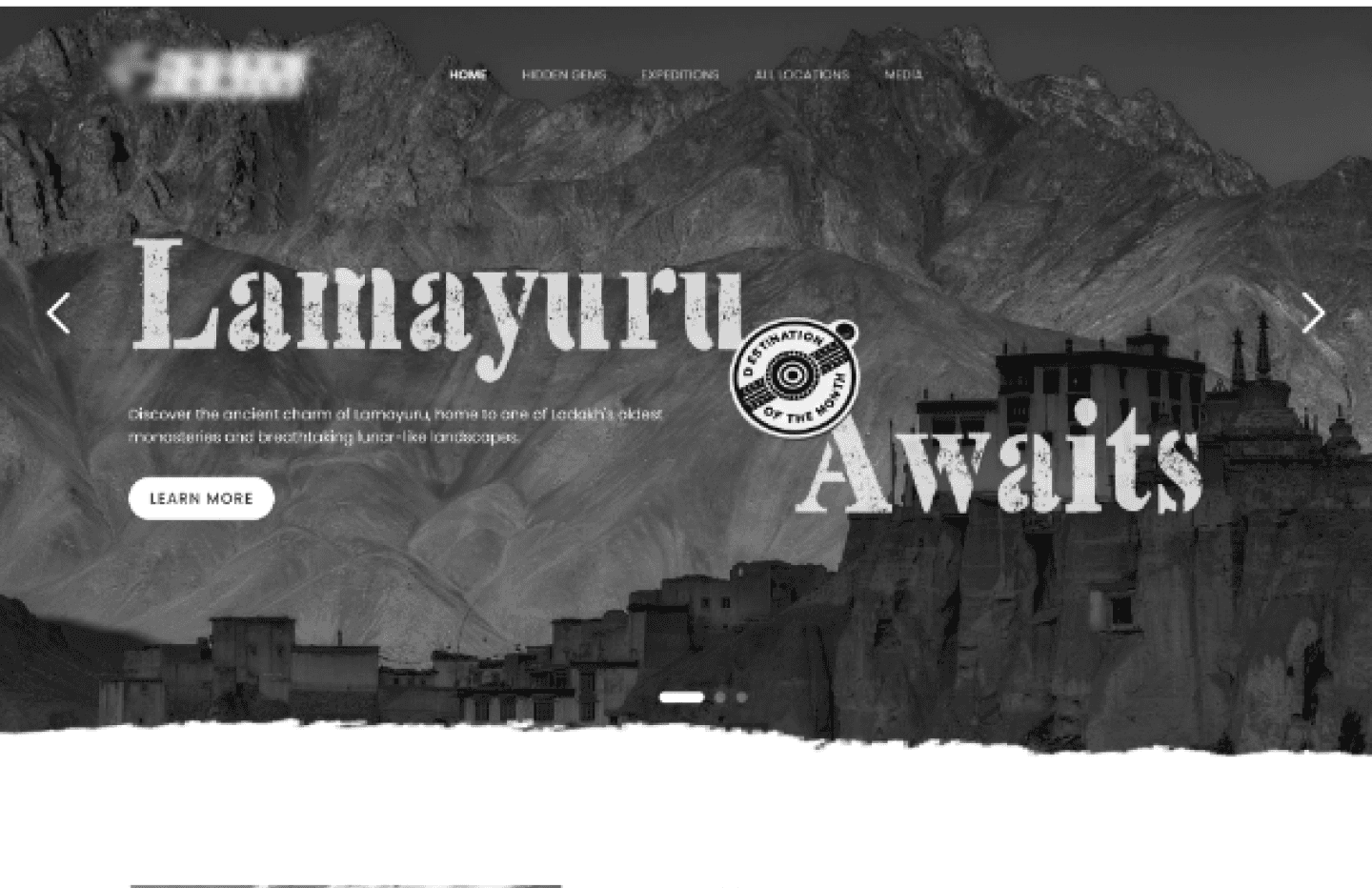
Sneak peek of visual design
Once the wireframes were approved, we, the UX team handed the designs over to the UI team, along with insights and client expectations.
The ask was for a bold, raw look and feel, featuring catchy headers, adventurous colours, and a unique style. Presenting to you, Crosstrails by India’s one of the top tyre manufacturing companies-

Learnings and Takeaways
As this was my first project with direct client interaction from the start, my key takeaway was in project management—specifically, how to adapt when a brief changes midway.
#1 Minutes of meetings (MoMs) are a live saver!!
The client was unclear about the company's new direction, but as the project progressed, our team documented MoMs and sent them after every discussion and approval. This prevented unnecessary iterations and helped guide the project in a clear direction.
#2 Auto layout makes iterations easier.
When building a design from scratch, always use Auto Layout! It simplifies iterations and helps the designer better understand how components function during development.
#3 Always design with responsiveness in mind.
Even for a desktop-first website, responsiveness must always be considered! No idea should be presented to the client without a responsive version in mind— this was a mandate!
See next project